Game: 2048
Creators: Gabriele Cirulli
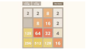
2048 uses a soft, cohesive sunset color palette to create feelings of calmness during game play that augments the game’s submission fun aesthetic. Each tile has a visual weight to it with a heavy-set san-serif font that adds to the game’s sensual visual satisfaction and feelings of serenity and pacific fun.
The proximity of the visual game elements (tiles, board, and score) never feel squished and the use of whitespace on the board allows the player to sink into the world without feelings of pressure or anxiety. The lack of a visible game timer is another strategic peaceful design choice, which augments the color palette, font, and use of white space.