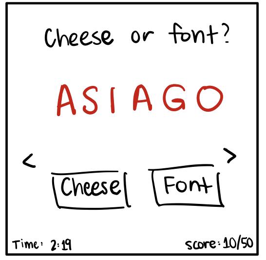
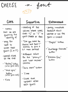
Below I categorize the elements of cheese or font
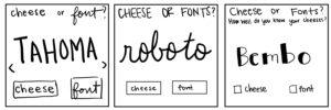
- Sketch out the core elements
- Make one element in a NEW thumbnail sketch HUGE.
- Try taking ONE color and using it in your thumbnail sketch along with black.
- Make 3–4 thumbnail drawings that use type in different ways
- Explore proximity in your design
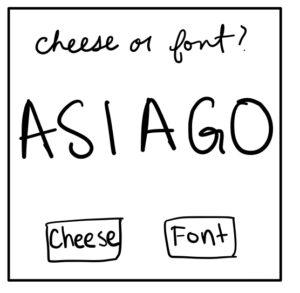
- In this design, I decided to leave space in the middle and align the title to the left side and all of the other elements to the right.
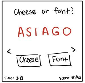
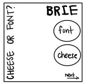
- I experimented by putting the title down the side instead of across the top.
- The font and cheese buttons are fairly close, but I think because there is a physical boundary (the circle) the separation is clear.
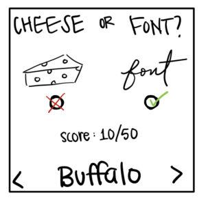
- Lastly, I experimented by switching the order of cheese and font.
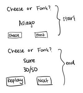
- In this design, it is important for the the “voting buttons” and the cheese and font icons to be grouped so that it is clear what element the button is associated with.
- I made sure to leave space between the “Buffalo” and the “back” and “next” arrows so as to make sure “Buffalo” had the main attention in the bottom section and the user didn’t feel “cramped”.
- Again, I left space between the cheese/font buttons and the score and the bottom section with the name and arrows.
Beautiful Game
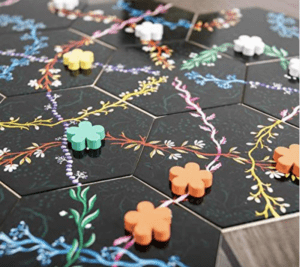
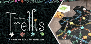
A beautiful game that has great visual design is Trellis, a calming game about building a garden. As can be seen in the screenshots below, the designers put a lot of intentionality into the game’s aesthetic, starting with the box. First, I think they used different types of font well. The contrast in the title font and the subtitle font work nicely to make the title the most important part while also calling attention to the tagline. I would also say that the font chosen for the word “Trellis” fits with the garden vibe as the words are long, delicate cursive and mimic a growing vine. The placement of the flowers and vines also seek to use the power of proximity and make the design look very tight and put together. Additionally, I really like the game board and pieces. The use of color contrast works well – a dark board with bright colored flowers.