


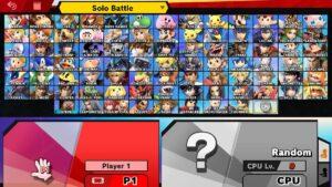
The Smash Bros character selection screen uses graphic design elements to make choosing a character and starting a game intuitive and quick. Rather than think about how to choose a character or if they are joined in the game, players can focus on just who they want to play as. Players that are not queued into a game are grayed out compared to active players whose status is shown via color (red in this case). The other differentiating color on screen is the bright yellow at the top that can change the game mode. The type of game someone plays is important and so visually distinguishing where this can be changed with a bright color is good design. The cursor on screen being a physical hand is a good trope for the concept of grabbing and selecting a player. Sizing between all characters is equal so as to not influence players on who to choose. The text uses bolding intentionally for larger points of emphasis. For example, P1 and CPU are bolded to distinguish who is who within a game.
