Elements of Cheese/Font:
- Core:
- Procedures: Player is given a list of words. They type in “C” or “F” for whether they think the word is a type of cheese or font. If incorrect they get the word wrong.
- Resources: List of random words
- Objective: Correctly guess if word is cheese or a font.
- Supportive:
- Timer and score (average and overall) – increases competitiveness as the goal is to get closest to 100% correct
- Extraneous:
- Hints when wrong answer – encourages user but does not actually help user achieve/get better
- Average score – not as meaningful as overall score
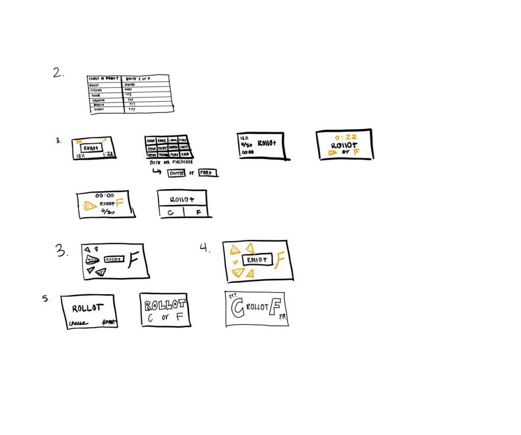
Looking back at how I arranged my designs, I can see proximity arrange in the different core objects based on relevancy. In each of my thumbnails, I made the word stand out boldly in the middle, as the most important core element. The “Cheese” and “Font” buttons were always the same size and on the same grid line, however I did not necessarily group them together. Most of the time, I had it set so that they were on either side of the word and different styles to distinguish them from each other. The time and scores were always grouped together but I always put them to the side, as they were not as important as the word and cheese/font buttons. Arranging it like this allows the user to be drawn to the important key factors in the game, but still able to see the time/score if needed.

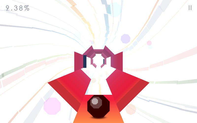
A game I think is beautiful is Octagon. I love the minimalist, colorful style the creators made to design the game. The white background makes the colors pop and give a very clean yet bright look. I like how the lane and ball are centered in the middle and are enlarged, so they pop out. The background is an extraneous element and the creator shows this by blurring it out. I also like how the game, while not many elements, takes up the whole screen.


