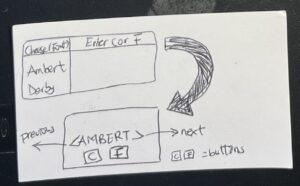
Analysis of elements
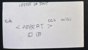
The key elements of Cheese and Font are the timer, the score, the table, the play button, the title, and the modes. Extraneous features include comments, ratings, scoreboards with other players, quiz creator spotlights, and other elements that can lead to clutter and may not necessarily enhance the gaming experience. To streamline the user experience, I decided to condense the table element by implementing a sliding feature that only displays relevant information – one font or cheese at a time. Since the user only needs to make one decision at a time, this approach would allow for a less cluttered view and without overwhelming the user with extraneous details. In addition, combining the modes into a single drop-down button would simplify the interface and make it more user-friendly.
Size sketch
To enhance the user experience, I made the strategic decision to increase the size of the central word in the game, thus shifting the player’s attention toward its core element. In tandem, I also adjusted the timer to match the new size of the word, ensuring that the user remains aware of the time constraint without being overly distracted by extraneous elements.
One-color sketch
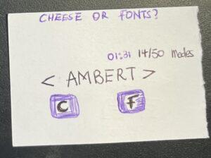
To draw attention to the timer and selection buttons for Cheese and Font, I blended the colors purple and black. By using this combination, I was able to create a visually striking contrast without overwhelming the user with an overly colorful interface that might strain the eyes.
Type explorations
By selecting italicized text, I was able to create a visual emphasis that drew the user’s attention to the title or the button(in one of the thumbnails). Additionally, I utilized block fonts to make important sections(e.g the word and button letters) stand out and to create a clear hierarchy of information. Finally, I chose to use serif fonts in certain areas to enhance readability of the header and the words as well.
Proximity exploration
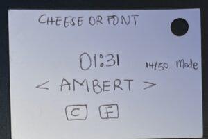
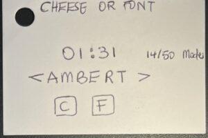
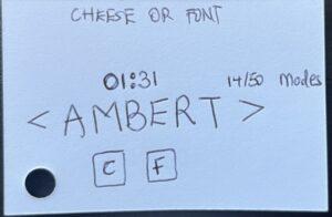
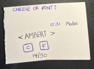
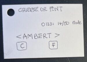
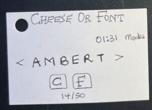
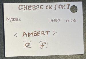
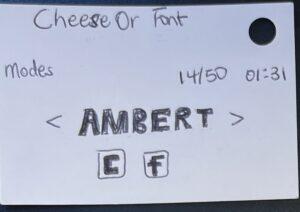
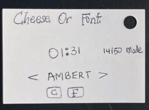
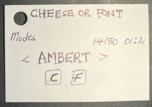
I explored various arrangements of the core elements to enhance the user experience. For example, I positioned the score directly below the buttons in the first thumbnail, enabling users to easily determine if their selections were correct. Alternatively, I separated the modes from the timer and score to emphasize their distinct functionality. In the last layout layout, I grouped the modes, timer,, and score together to promote efficient user actions.
Elevate – game under consideration
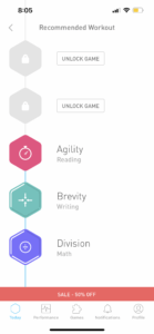
Elevate, a brain-training game, stands out to me for its beautiful design and seamless user experience. This engaging game utilizes key graphic design principles such as alignment, proximity, size, and color to create an aesthetically pleasing and intuitive interface.
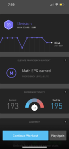
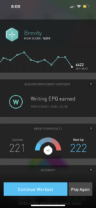
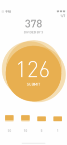
One of the design principles applied in Elevate is alignment and proximity. This ensures that the user’s eye is drawn to the most important elements on each screen. For instance, on the division page above, the score and difficulty levels are aligned next to each other, effectively conveying their relationship. The game’s other components are also grouped into sections, allowing the user to coherently follow the order of presentation without confusion. This thoughtful organization contributes to a more streamlined and enjoyable gaming experience.
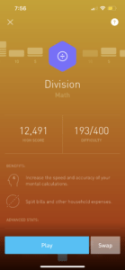
Size is another crucial aspect of Elevate’s graphic design. Throughout the game, size is used to emphasize key information and reduce distractions. A notable example can be found on the division game page, where the currently computed number of the user is enlarged. By doing so, the user can properly view their answer before submitting it, enhancing focus and reducing the likelihood of errors in this fast-paced game.
Each section of the app is also dedicated to a specific skill (writing, reading, speaking, or math) and features a distinct color that remains consistent throughout. These colors have been carefully chosen to blend harmoniously with the game’s grey and ash background, even though they belong to different color schemes. This consistency not only creates a visually appealing interface but also helps users easily identify and navigate between sections.