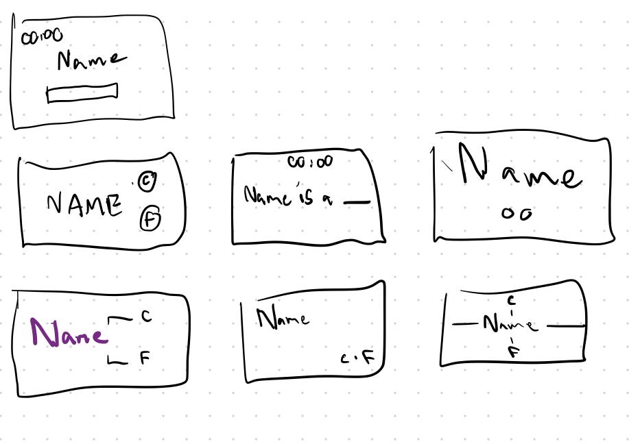
Font or Cheese Game Elements:
Core:
– Current Cheese Name
– text entry box
supportive:
– Score
– timer
– Pause Button
– Prev/Next buttons
Extraneous
– results table
– wrong answer messages
Redesign Thumbnails:

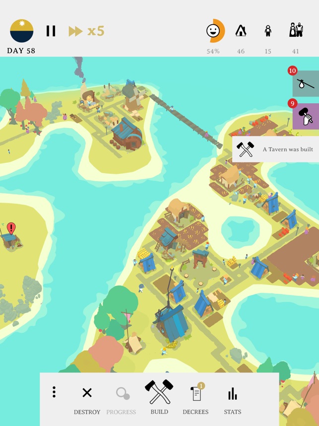
I think the game Outlanders is really pretty:

I played it on iOS and fitting everything you need for a civilization builder game onto a phone screen is a really challenging task, but they did a good job with it. The map makes really good use of color and contrast to keep everything bright and easily visible. the towns are also laid out on a grid which makes it a lot easier to understand where everything is.
In terms of menus, they nicely cluster everything to the very top or bottom of the screen. This creates a good balance where the vast majority of the screen is for the map and only a little bit is for the UI. The UI elements are grouped into areas of day/time info, resources in the top right, notifications along the right side, and then actions at the bottom. This grouping of similar items helps keep things clear.


