PART I:
Exercise 1, Identify elements of cheese or font
- Prompted by a word, player must guess cheese or font by typing ‘c’ or ‘f’
- Simple guessing mechanic and receive instant feedback whether it is correct
- You can click prev/next on any option to skip specific options. Prevents player from getting stuck
- Verifies player answers immediately
Core Elements:
- Time element
- Column of cheese/font names
- Row to put your answer
- Score keeper, sense of if you are winning
- “Enter C or F” → clear instructions for how to engage
Extraneous: (Elements that could be removed and gameplay is unchanged)
- Funny lines when you guess wrong
- The design of the game (shape, coloring) looks like a block of cheese

Exercise 2, Sketch the Core:
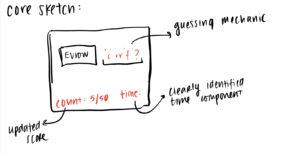
The core elements of the game are a prompt of word that is unknown whether it is cheese or font, a place to input your answer, a count tracker, and time tracker.
Exercise 3, Sketch Layouts:
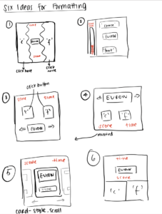
I explored various layout ideas including card style (5), opposing sides (1), where the prompt is in relation to the options to click (3, 4, 6).
Exercise 4, Sketch Sizes
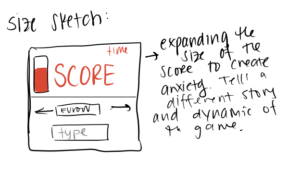
I expanded the size of the score element to create a sense of anxiety. This may tell a different story and make the game more high-stakes and “winning” oriented. Along with this, the prompt became smaller and the typing block is also smaller and below the score. It shifts the dynamic and emphasis of the game away from Discovery to Challenge. Rather than being focused on discovering which word is cheese/font casually, it places more emphasis on winning and being right.
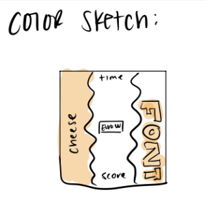
Exercise 5, Color Sketch:
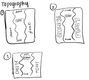
Exercise 6, Topography Sketches:
Exercise 7, Proximity Sketches:
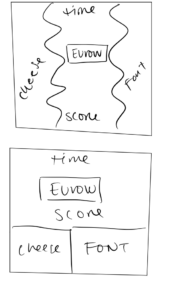
When exploring proximity, I found that there are two different ways to think about how things could be formatted in this game. Since the game is a binary choice, the cheese/font could be placed in different ways to emphasize that binary choice. For example, in the first example, they are on opposite sides of the screen and we visually get the sense of one vs. the other. However, in the second choice, I explored how the two can also be grouped together to separate the game into two parts: information (prompt, time, score) and answer (cheese or font).
PART II:
Civilization 5 is an incredibly complex game that at times could be visually overwhelming. However, expert game design helps keep it extremely parseable and simple to navigate.
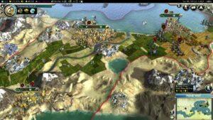
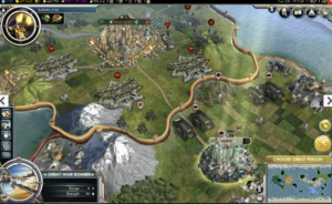
The top row are all of the elements of your civilization that you need to keep track of over the course of multiple turns. An individual turn is much for focused on the map/visual itself (moving troops and workers around, engaging with each of your cities). However, on the larger level, you have a header bar that keeps you updated on science development, economic status, cultural development, happiness, etc of your civilization. These are things you can monitor every 10 or so turns to check the health of your civilization.
What works well is that the game designers use clear metrics to help you identify when things may not be right. For example, when your civilization is happy, it has a green number next to the happiness icon. When your civilization becomes unhappy, it quickly switches to red. Therefore, you are visually cued to pay attention to it.
This top navigation bar uses the principle of proximity by grouping all of these items together, so that a player can do one quick pass over all of these features to get a quick overview of how their civilization is doing. Further, through the principle of size, it emphasizes that these are not immediately as important on the turn-by-turn gameplay level. They are almost equivalent to an energy or health bar in other games. Further, these icons pop out against the dark bar they are placed on.
The visuals of the game are also highly adaptable, players can change the style of their map from real world view to hexagonal view. This allows players to have their visuals match their desired play style (from strategy to more narrative with real world viewing).
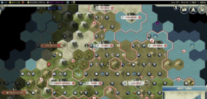
In terms of size and font, the game is consistent with font. However, due to the complexity visually of the game, it leans heavily into iconography. The screen consists of various icons that the player can hover over/click on to see what they mean, but are left as icons to avoid overwhelming the viewer.

