


The following is my attempt at the exercises from the article Graphic Design for Game Designers. It uses the quiz game Cheese or Font for the exercises and analysis of graphic design principles in games. Later I will use some of the principles on Hollow Knight!

Exercise 1: Elements
Identify all elements of Cheese or Font.
Core elements – needed for gameplay
- Cheese and font names
- Player guessing
- Way to verify player answer
- Score/way to “win”
Supportive elements – things such as hints or suggestions
- labels and instructions
- “Cheese or Fonts?” column
- “Enter C or F”
Extraneous elements – can be removed and are not essential for gameplay
- Jokes that accompany the “incorrect” answer message
- timer – argument could be made that the timer is a core element as well, it just depends what is most important to the designer.
Exercise 2: Core
Sketch core elements of the game.

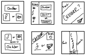
Exercise 3: Layouts
Come up with 6 more ways to arrange the most important elements.
Exercise 4: Size
Make one element in a new thumbnail sketch HUGE. What else changed?
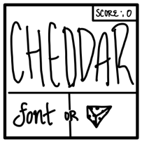
I wanted cheddar to be the largest element and it ended up making the option buttons bigger as well. The score got smaller, and I almost left it out. It forced me to utilize all my space better and led to a more fun, simple design.
Exercise 5: Color
Use one color and black in your thumbnail.

Exercise 6: Typography
Make 3-4 thumbnails that use type.

Exercise 7: Proximity
Explore proximity. What should be grouped? What is different?

Word and options need to be together. Nothing else even needs to be on the screen because they do not affect the gameplay.
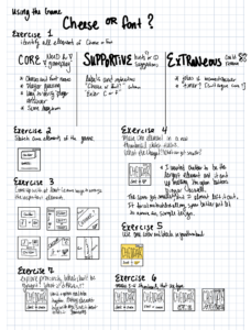
A sketchnote-esque version of my exercises:
Applying these principles to a different game
Hollow Knight is a challenging, beautiful 2D platformer action-adventure Metroidvania video game developed and published by independent developer Team Cherry in 2017.
Just take a look at some of these screenshots to get a sense of the style!
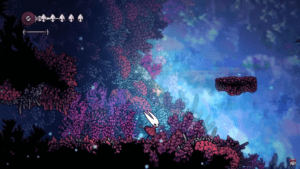


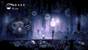
In the top left corner is your focus energy (big bug skull), your health bar (the 4 small bug skulls in a row), and your geo (currency). Using the principle of proximity, these items are grouped together. I would say the health and the focus are the most important in that grouping which is why they take up more space in that box the three elements share. They also pop out more due to being white on the dark background. The horizontal alignment/line connecting the health and focus energy utilizes visual hierarchy and draws the eye to both elements, which is useful during quick-paced boss battles when the user can only glance at the information.
The characters on top of the art style really highlights the importance of line weight! All the backgrounds and non-characters are this really fine, soft, well blended art style. The characters are outline in a chunky black outline which makes them pop in the dreary, dim scenes.
They also beautifully use lighting to guide the player where to go and what to interact with. In the second image above, the Hollow Knight is sitting on a spotlighted bench. These benches serve as checkpoints/a way to save your progress in the game.
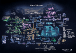
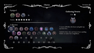
Hollow Knight’s map of Hallownest and Charms inventory screen also showcase their mastery of proximity and color and typography! All these elements really match the art style used in the levels and help convey the broken down, mysterious yet somewhat enchanting feel of Hallownest.
