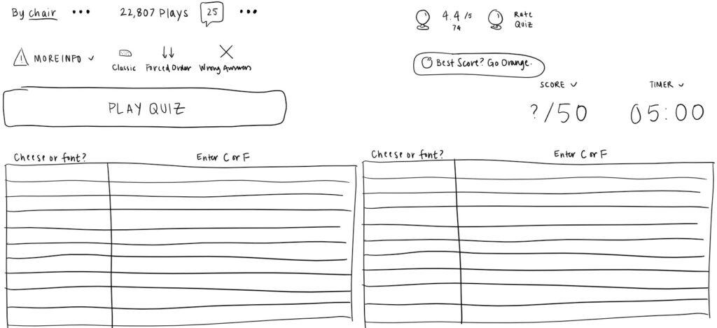
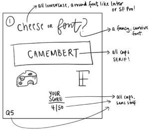
Core elements: categories such as Cheese or Font and the name of the game; items such as the list of cheeses and font names; feedback such as “Affinage takes 4-5 weeks in this buttery-tasting cheese.” or “Cheese”/”Font”; the input method (“C” or “F” keys on keyboard); the entry box.
Supportive elements:
- Feedback: black font color if correct & red font color if incorrect
- Subheading: “Can you name the cheeses and fonts?”
- Table/Grid: column headers with instructions, iterating in order from cheese/font to cheese/font, highlighted current Cheese/Font
- Table heading: “Cheese or font?” & “Enter C or F”
- Result: “Cheese” or “Font”
- Animation: “PLAY QUIZ”/<-PREV/NEXT-> buttons; the score & the timer.
Extraneous elements: all cheeses/fonts are listed, all previous answers are visible, wrong answer triggers fun fact, average score, pause option & give up option.
Sketch of core elements:
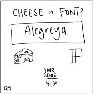
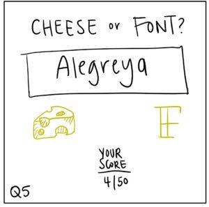
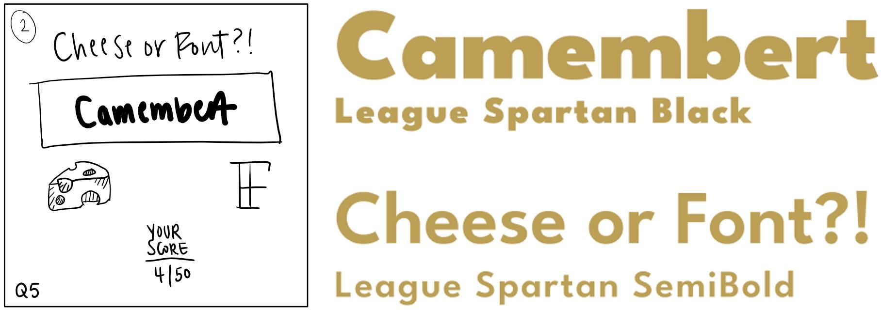
Enlarging 1 element (I enlarged “C” and “F,” if you will) in a new thumbnail sketch & using 1 color (gold) in thumbnail sketch along with black:
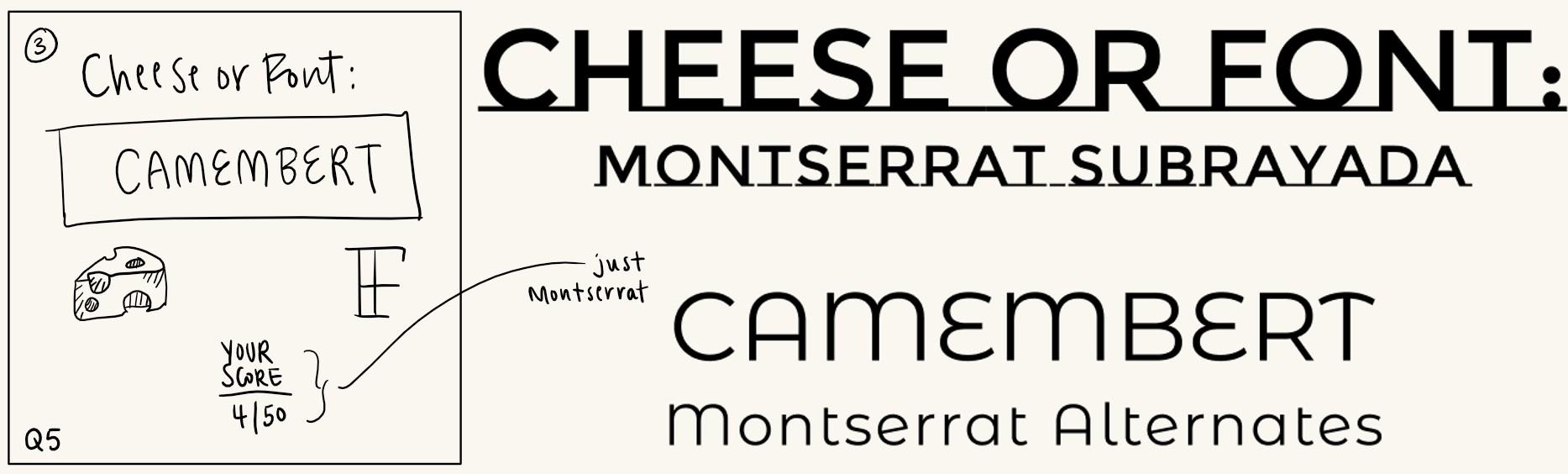
4 thumbnail drawings that use type in different ways:
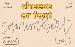
Exploring proximity in my design: I played w/ proximity the most in my fourth sketch! As you can see above, the cursive cheese/font (in this case, cheese) actually cuts into “cheese or font,” which, in turn, is in two lines instead of one. The questions/points and cheese button/font button are also in corners now.
Pick a game you think is beautiful, take a screenshot and explain what graphic design principle(s) they used to make it great.
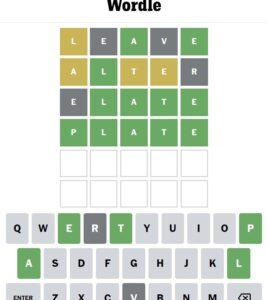
Wordle uses a limited color palette consisting of black, gray, and white; the use of high contrast black and white colors helps to make the game easy to read and understand. The New York Times uses a simple sans-serif font for its letters, making them easy to read and distinguish from one another. Additionally, the letters are all the same size and are aligned in a straight line, creating a clean and organized look. The layout of Wordle is well-balanced. The daily five-letter word creates a sense of symmetry and visual harmony. Wordle utilizes negative space effectively, leaving plenty of blank space around the letters. This helps to draw the player’s focus to the five letters! Wordle employs a consistent design throughout, with each daily round featuring the same font, color scheme, and layout. This creates a sense of continuity and familiarity for the player.