

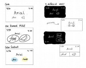
Core
List of cheeses or fonts
Location to indicate your guess
Score or indication of whether the guess was correct
Timer
Supportive
“Enter c or f”
Buttons like prev/next
Hints
Pause.resume
Extraneous
Quit
Wrong answer comments
Historical avg. score of all players
Quiz stats, challenge friends, shuffle
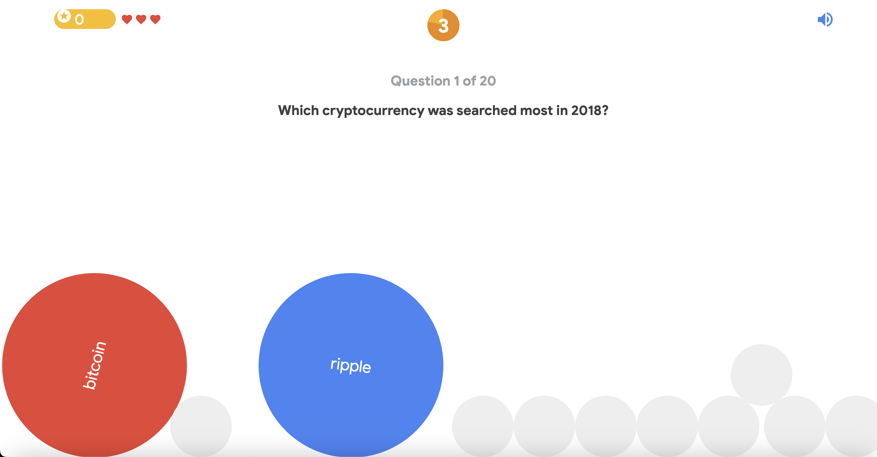
A beautiful game: Game of the year by Google

This is a beautiful game design for a couple of reasons. Firstly, the color contrasts of the options (R and B) are quite well and the shape size contrast (main options big circle and colorful while environment circles being small and gray). The colorful circles are also located close to each other (proximity) that allows me to see both options at once without changing my eye location. Secondly, the game use proximity to draw attention to the important elements of the screen (question, options, number, lives, sound). The whitespaces are carefully given to make the appearance relaxing while also not cutting down on information. Lastly, the use of font styles emphasize hierarchy (question more important hence in bold; question number less important thus less bold).
