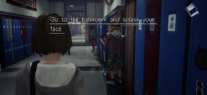
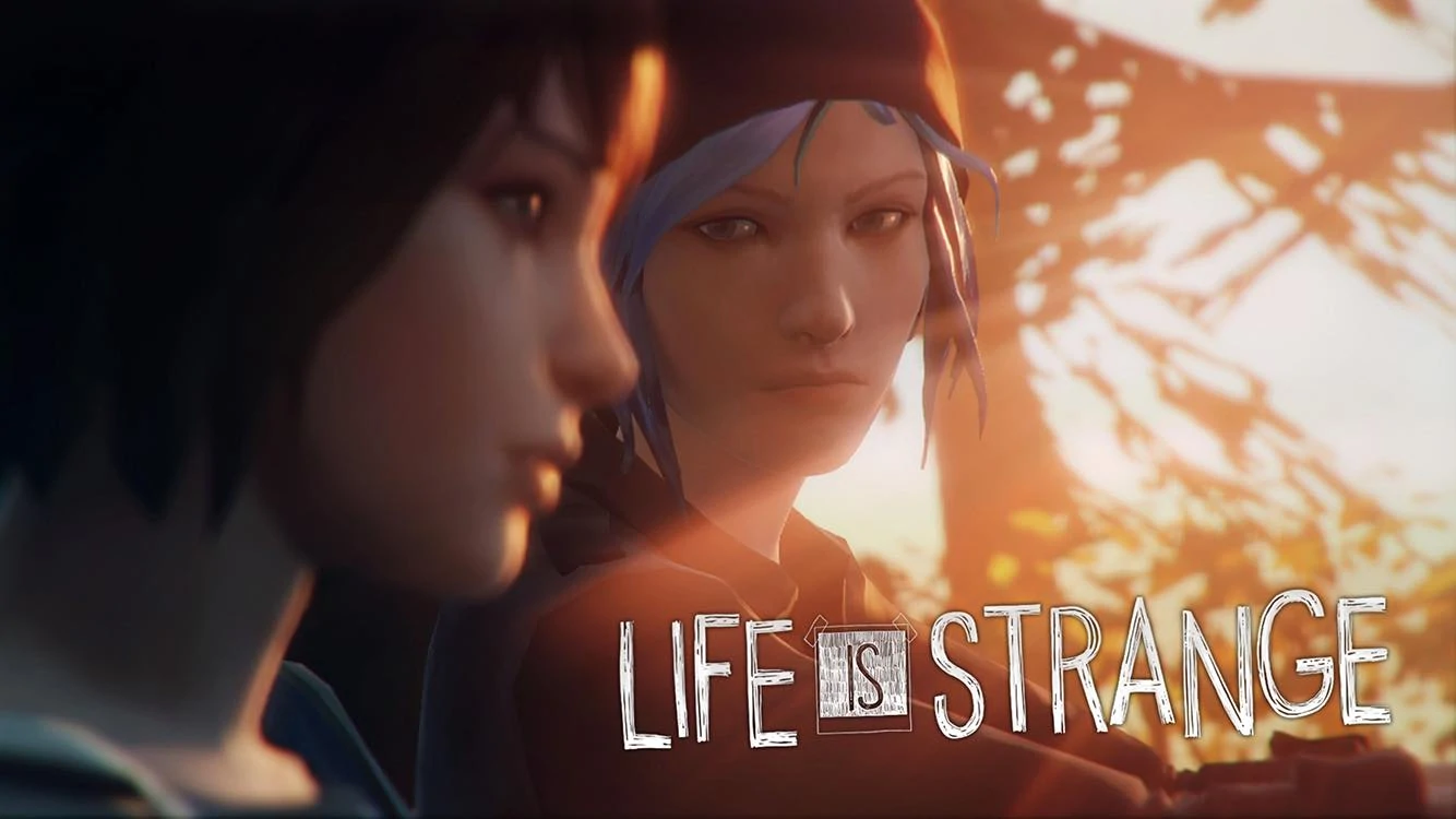
For this critical play, I played the game Life is Strange developed by Square Enix Ltd, DontNod Entertainment, Feral Interactive, Black Wing Foundation, and Deck Nine on the IPhone/IOS platform. In terms of the storyline and action sequences, this game is definitely one I would recommend for anyone over 8-10 years of age. There can be sequences that are dark, stormy that might spook/scare children, but otherwise anyone else could reasonably enjoy the game and find it stimulating.

The most important formal elements of the game would be:
- Player Interaction Patterns
- Objectives
- Procedures
- Boundaries
For player interaction patterns, this game is heavily focused on a “single player versus game” model. You are the main character exploring the game and navigating various scenes.
The objectives the main character must complete are deeply integral to the storyline progress. There seem to be mini-tasks that build up to larger objectives which I enjoyed, since I constantly felt guided and never lost on what the next steps were; there was good balance between me figuring out what to do and the game offering hints or directions. Furthermore, this game relies heavily on an exploration style of completing objectives: you must walk around, analyze your environment to find the elements of the game you must interact with to progress.
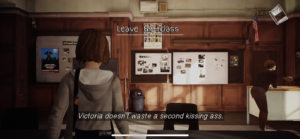
For procedures, I enjoyed the intuitive way the game set up player mobility: looking and moving are easy to pick up as simple interaction loops. These interaction loops then form compound interactions to accomplish objectives i.e. in the starting scene, we had to approach the lighthouse. To do so, you had to learn how to look around. Then you had to learn how to move. With those two interaction loops, you could direct the player to the lighthouse by looking and moving towards it to accomplish the objectives.
Lastly, the boundaries of the game definitely play an important role in how the gameplay progresses. Since this game rests upon a foundation of exploration, the game had to put in place where players could and could not go, what they can and cannot do. Players cannot fly or walk through walls, tying the game into reality, and my player could not walk into certain areas. This latter aspect gave good feedback that I might be going in the wrong direction or that maybe I need to think back to what my objectives were.
The type of fun for this game is narrative largely; the storyline of the episodes is integral to the objectives and makes for a cohesive gameplay. I think the game met its goals of being a narrative game that involves adventure, because I found that the storyline of each episode kept me invested; there was no narrative dissonance with the objectives which made the whole experience more immersive.
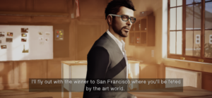
Some moments of particular success is when I mastered player mobility. The game would give hints, such as highlighting the door or giving signals like “Look” on the screen, but after the first episode, I was moving quickly through the tasks without needing to refer to the directions.
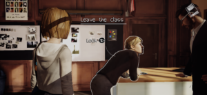
I think I would make the game less full of the “Look” indicators because they clutter the screen and are a bit of an annoyance. Simply highlighting the items that are interactive would have been sufficient and cleaner for the user experience. I would have positioned my camera (my “eyes” in the game) farther away from the character; it seemed like my point of view was only inches behind the protagonist’s body which made my view feel cramped. If I could have zoomed out, I think I could have analyzed more of the room(s)/environment(s) without having to make the protagonist look in every direction just to bring aspects into my field of view. Lastly, the directions are quite large and cover critical portions of the screen since they’re in the top center; I would move the directions to the top right and make the font smaller.
