Cheese or Font Exercises:
Persona 5: “Looking good Joker!”
I choose to analyze Persona 5, a JRPG developed by Atlus and P Studio. One of the first things I noticed when I first played Persona 5 is just how stylish the UI design of the game is. It’s something that was continuously visually appealing even after hours and hours of gameplay, I never got tired of looking at it. It’s truly one of the most beautifully designed games in my eyes. Let’s start with an analysis of the pause menu.

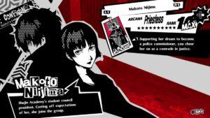
Right away you’ll notice that Persona 5’s developers took advantage of quite a few graphic design techniques in this menu alone, namely size, color and contrast, typography, and alignment and proximity. When a player hovers over one of the menu items, like the player in this screenshot is hovering over “Skill”, the word is made bigger and given a bit of color. That splash of blue especially helps to bring attention to the fact that this is the current selected menu, because it’s so much of a contrast from the games main theme colors, red, black, and white. One of the main things characters in this game mention is being stylish, it’s something the protagonist especially likes to be. The movement in dungeons is stylish, the attacks during fights, especially all-out attacks, are stylish, and it’s all complemented with an equally stylish menu which has this font that just screams, this is our style. The alignment of all the menu items on top of one another help to emphasize the proximity between these items and the amount of yen you currently have. The menu items are selectable for further options, the amount of yen you have is just for your information. I honestly can’t do it justice through screenshots alone, but I highly recommend looking up a video of gameplay and just watch someone navigate this menu. Joker, our protagonist in the background, is always there, but he switches poses depending on the menu you select. For example, if you choose to select party and look at more information on one of your party members (picture below), you’ll notice that they’re always back to back. I’m not 100% sure if I can use proximity here, but I like to think that by have the characters back to back to the protagonist, it shows that there is bond there between them.
Next, let’s take a look at Persona 5’s iconic battle UI.
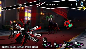
The choice for typography and color and contrast is more or less the same as the regular pause menu with the added color for each button that corresponds to the button’s color on the Playstation controller. The biggest thing I want to highlight with the battle UI is the use of alignment and proximity. For starters, the main actions that you are able to take are shown surrounding your character, it’s a nice way to bring focus to who’s current turn it is in the party. In addition to this, the four actions on the right side are actually the most used actions during a turn. The order action just lets you change how your party members act which you usually only set once in the beginning and maybe on another rare occasion, and the gun action allows you to shoot your gun, but you have a limit of bullets so you only use it when it’s most useful. Thus you are left with the other four actions, persona (let’s you summon a persona to use), item, guard, and attack. I just thought that was pretty interesting to point out as I’m noticing it now looking at this screenshot and recalling that those were the main actions I took when I played. On the bottom left of the screen you have a bunch of secondary actions, then on the bottom right you see your parties health and sp. Top left you can see the name of our enemy and their level (when you encounter an enemy for the first time the”name” is just a description of their appearance, to learn their true name you have to talk to them). And finally on the top right you can sometimes see comments your party members make during the battle. The core elements (in terms of UI) here would be the main actions surrounding your character. Supportive elements are the secondary actions, the party health and sp, and the name and level of the enemy (as well as the indicator of the current selected target and their health). Lastly, the extraneous element here is the comments your party members make during combat.

Strong write up! I’d love a couple paragraph breaks…. on a monitor, it’s harder to read so places you would not put paragraph breaks in a printed paper, you might want to put in on a blog post.
THanks for introducing me to a new game!