Elements in Cheese or Font
- Core elements
- Items to categorize (cheese/font names)
- Text box for typing guesses
- Timer
- Supportive elements
- Score display
- Next/previous buttons
- Columns labels (“Cheese or font?” and “Enter C or F”)
- Witty comments on incorrect answers (e.g. “NOT FONT. RAGUSANO CHEESE YUMMY.”)
- Extraneous elements
- Ads
- Other Sporcle elements (quiz stats, quiz recommendations, sign up button, etc.)
Thumbnail Sketches
Here’s my initial sketch of the core elements:
Here are my 6 exploratory thumbnail sketches:
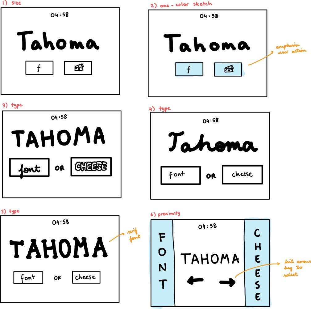
In terms of proximity, I think the timer, word to categorize, and input should be clearly separated. In my initial sketches, I did this by grouping together the font/cheese buttons to make it clear what they are. However, in my proximity exploration sketch, I decided to separate the buttons on either side of the screen and put the timer and word between them. I think this still works okay since the font/cheese buttons are grouped by color, and I think using the arrow keys to quickly select left or right would place more emphasis on the game being fast.
A Beautiful Game — Guildlings
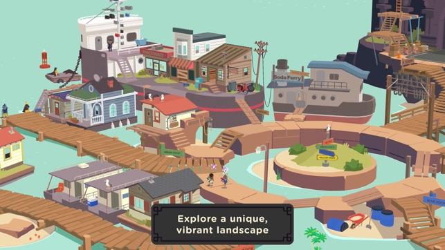
One game I think is beautiful is Guildlings: a 2019 fantasy adventure game developed for iOS by Sirvo Studios. It was a featured release on Apple Arcade, and thus consumed my life when I bought a new phone last year and got a free Apple Arcade trial 🙂 It’s described as an RPG set in a world of “wizards and wifi”.

The goal of Guildlings is to complete the main quest (restore the main character’s corporeal form) and various side quests (mostly fetching items). Gameplay consists of a few different modes, such as world exploration, conversations with characters, and monster battles. Guildlings makes use of several visual design principles to craft a beautiful gameplay experience.
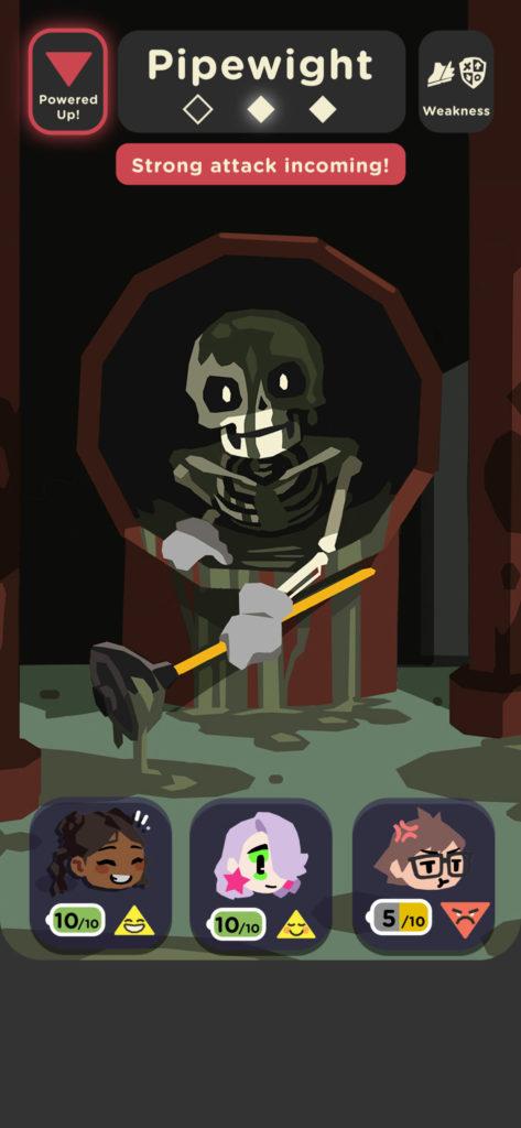
Few Extraneous Elements
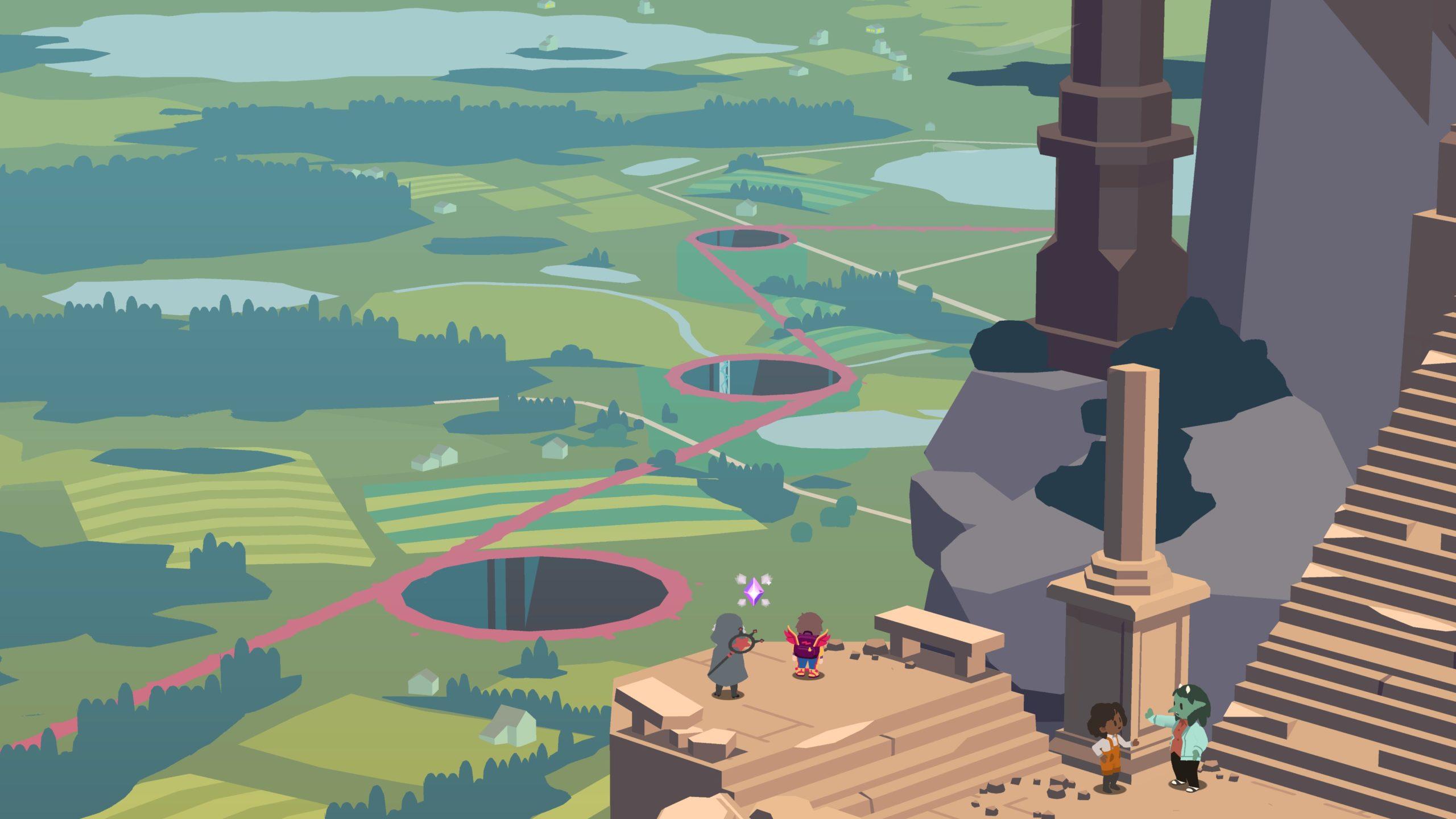
When the player is exploring the world and walking around (which makes up the majority of gameplay), there are few extraneous elements on the screen that could be distracting or make the screen feel cluttered. Only critical information is displayed, such as the current location or number of coins, as well as buttons to see different menus. In addition, these elements are very small compared to the rest of the screen, so they don’t detract from gameplay.
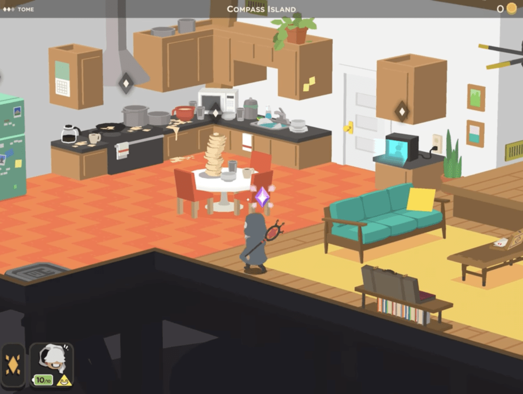
Color
Guildlings effectively uses color for world-building: There are several different areas within the game that have different personalities/vibes, and color is used to communicate this. For example, Port Chumpus, a run-down port town, uses much duller colors compared to other areas. The use of color helps characterize each area and evoke different emotions in the player depending on where they go.
Type
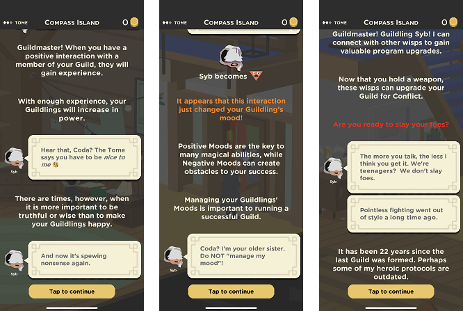
Guildlings uses a sans-serif font throughout the game to communicate a modern feel (since we are in the world of wizards and wifi). However, the game uses differently colored fonts to emphasize important events in conversation and draw the player’s attention. For example, hints within the tutorial at the beginning of the game are displayed in orange to differentiate them from the rest of the text.
Proximity
Finally, Guildlings makes effective use of proximity in screens related to combat. Specifically, everything related to the player’s party (characters, health, etc.) is grouped at the bottom of the screen while everything related to the opponent/monster is grouped at the top. This clearly communicates to the player which elements are related to what and helps avoid confusion.