

Cheese or Font? Exercises
Elements of the game Cheese or Font? include:
- Core: list of mystery names (of either cheeses or fonts); area to enter your choice of Cheese or Font; score tracker; timer; “Play Quiz” button to start the timer
- Supportive: hint text (“Cheese or font?”, “Enter C or F”)
- Extraneous: score and timer dropdown options; “Replay” / “Next quiz” / “Quiz stats” / “Challenge friends” / “Random quiz” buttons; flavor text on wrong answers; flavor text on final score; average score
Thumbnail sketches:
- First row: core elements sketched; one element made huge, then accented with color.
- Second row: experiments with type.
- Third row: proximity exercise.
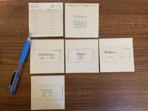
For the proximity exercise, the “font” and “cheese” buttons should be grouped most closely together because they are the two options in a binary set. Those options, as a set, should be grouped most closely with the mystery name, as that is what the options apply to. The scoreboard (which also serves to mark progress to the end) and timer should be grouped close enough to the game that they are clearly part of it, but they can be slightly separated since they are not part of the core interaction taking place.
Beautiful Game Analysis
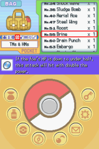
I’ve always looked to the Pokémon Diamond & Pearl Bag UI as one of my favorite examples of video game menu design. This menu would typically be displayed on a Nintendo DS, so the top and bottom halves are intended to appear on separate screens.
Because all of the text in this menu is nearly the same size and font, the top screen instead primarily uses color, shape, and proximity to enhance readability and please the eye. In the green zone, identical formatting and close proximity ordered by a grid identify the items in the current “pocket” (submenu) as a group; similarly, in the orange zone, visually-similar icons ordered by their own grid identify the set of all possible pockets as a group; and across both zones, visually-similar red borders indicate which pocket and item are currently selected for a coherent visual language. The color-blocking used on this screen is not strictly necessary, since proximity and similarity are already effective in grouping items together appropriately, but it serves to add visual interest and create a whimsical atmosphere. The intense saturation of the non-interactable flavor-text box at the bottom of the screen also serves to clearly separate it from the scrollable lists above it.
The bottom screen (where touch-interaction can take place as an alternative to using the buttons on the handheld) contains no text and instead uses icons to map its components to the affected components on the top screen. The buttons, each of which opens a different pocket, display the same icons in the same order as the pocket list in the top menu, making the relationship between the two visually intuitive. The unusual radial arrangement of the buttons around a central Pokéball graphic is made parsable by the visual similarity of the buttons to each other as well as to the background — their visual design creating the illusion that they are physically-raised buttons, clearly separate from the graphic in the middle.
