First, I identified the core, supportive and extraneous elements for the game, and created some initial thumbnails.
Initial Thumbnails
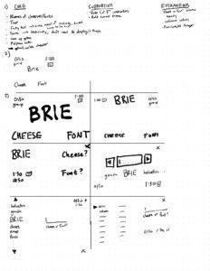
I decided that a number of elements, like sharing the score, or replaying, weren’t necessarilly core UI elements – implicit in that assumption was the idea that it would be browser based, and the page could be refreshed. Realistically, given this is all the core elements, I likely should have included them as well in the core pieces. I also ended up varying a number of the elements that we would later explicitly explore, like size and proximity, which reflects how core they are to design.
Then, I varied a range of elements for readability and emphasis: the size, color, and typography:
Varied Elements
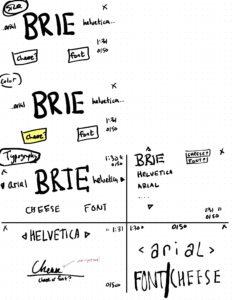
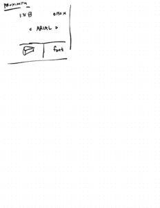
Although I’d already varied some of the elements, here I explicitly focused on changing specific parts of the design.
Case Study: Tunic Manual
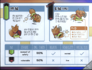
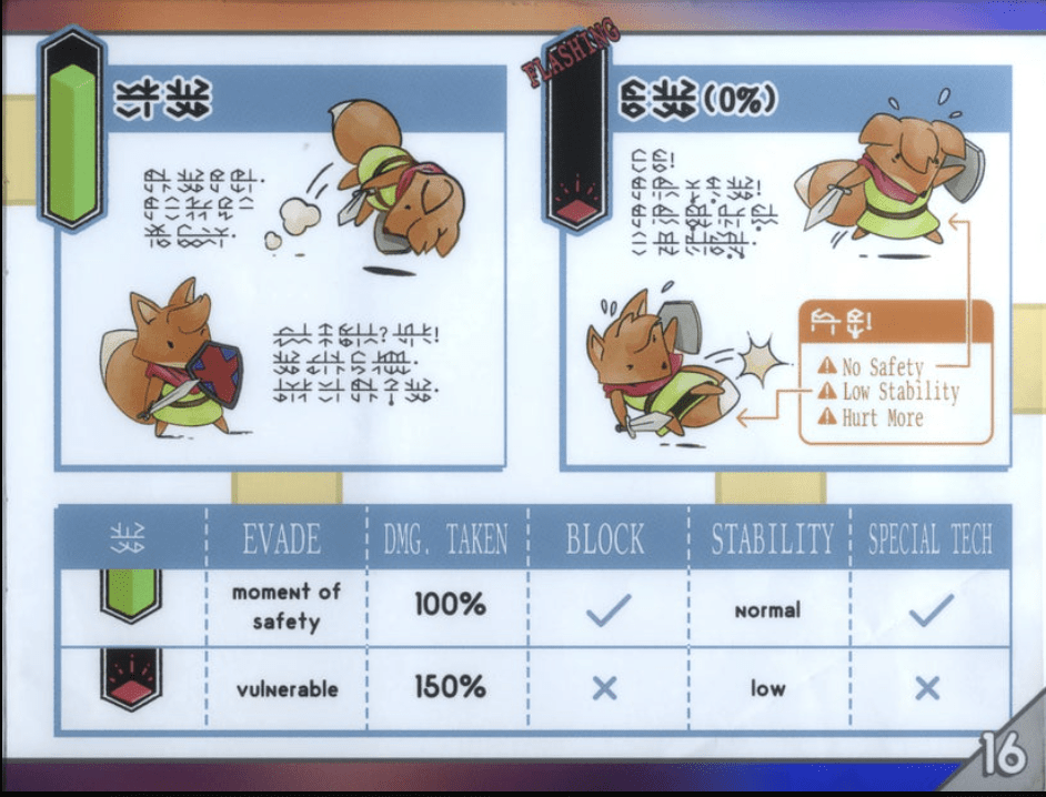
Tunic is a recently released game that makes very interesting choices in it’s visual language. The core conceit of the game is that, as you play, you reveal pages from the in-game manual, which evokes an old Nintendo Power guide. However, instead of simply getting pages, you have to translate them – as you can see, some of the writing is still untranslated in the above section.
Although every mechanic is technically available immediately, in practice you have to try and interpret the pages to figure out what they mean.
I think this is especially interesting because so much of the text is unintelligible; the design choices have to stand by themselves.
Here, we see neutral background blue, with green and red for specific emphasis of the ‘safe’ and ‘vulnerable’ states. The bolded text of the two top text boxes – presented next to each other – make it clear that there’s a relationship between the two. The orange callout box on the right immediately catches your eye, and signifies danger.
Meanwhile, the table at the bottom pops out less immediately – the white on blue headers in particular are more subtle – which means that they lend themselves to slower consideration, or for use as a reference rather than immediately drawing the eye. Given they expand on the basic concept, this makes sense.
Just in general, the way that this aesthetic evokes an old N64 game that just got lost really does a lot to contribute to the charm and visual appeal of the game as well. It supports the theme, and the fact that some things are obscured really makes the player engage with it.

