

Visual Design of Uno
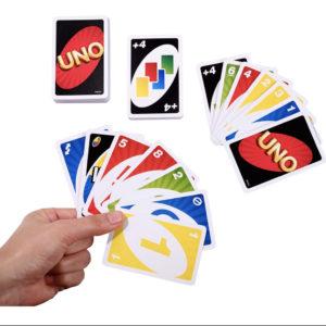
The game I chose to explore is UNO – a classic card game. This has and remains to be my favorite card game growing up, so I thought it would be a perfect example for this assignment.
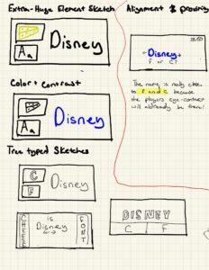
Size: The designer Merle Robbins was able to deliver the most important information through good choice of sizes. Having a big and centric number draws eye-contact.
Color & Contrast: This game comes is both vibrant and minimalist. Utilizing only vibrant primary colors, it is incredibly easy to distinguish the colors from each other. The fact that each card only has one color + white makes it very easy for the player to tell which color is which, which is super important given the importance that color plays in the game.
Typography: The designer uses the same font family everywhere just changing the color, creating a nice symmetry.
Alignment & Proximity: I like how the number are the center of the game, as it draws the player’s eye contact and makes it incredibly easy to read.
