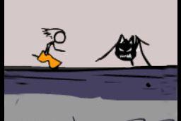
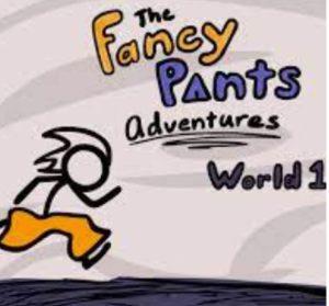
I think that there is going to be a streak that I start devleloping in this class. I really like this game, so I apoloigze if it makes it’s way into damn near everything that I write. The Fancy Pants Adventures universe is an amazing one. It’s purposefully cartoonish and revels in its childishness. The main character wears bright orange pants, often in dreary, gloomy climates. The user can customize his outfits as the game progresses, but the choices are always in stark contrast with the background. This focuses the user’s attention on the main character at all times.
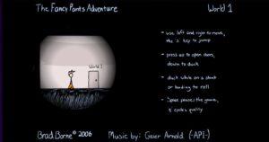
(It’s dark for some reason at the beginning of the game)
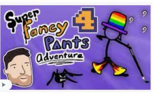
(He’s really bright in this one)
Additionally, the graphics designers made use of size differences in a meaningful way. The main character most often gets into fights with creatures like rodents and spiders. However, they’ve been grown to his size. The designers did not keep the normal size ratio between the two in order to enhance the fantasy that the player must buy into. It makes everything seem more dangerous but also easier to conquer.
Lastly, the game does no pairing of different fonts. Rather, they keep it consistent, with goofy comic-san-like typography. The game isn’t meant to be taken seriously, and it this kind of self aware writing that makes it all the more endearing.
Also, the exercises:)