

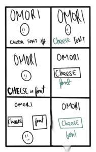
I guess for this exercise I played with the ideas of having the template, color, size, font, size, and shape to find out which had the best visual hierarchy. I kind of liked the idea of playing with color and user eye flow by having a z style flow with the option for continuing to be at the end of the flow. I think it works best when the color or shape is different from the rest of the flow. I think this was because on a fundamental level color and shape are visual cues that the human eye picks up on faster than the other elements, this is not to say that the other elements aren’t as important, but it was vital for me to see this outcome through trial and experimentation.
