

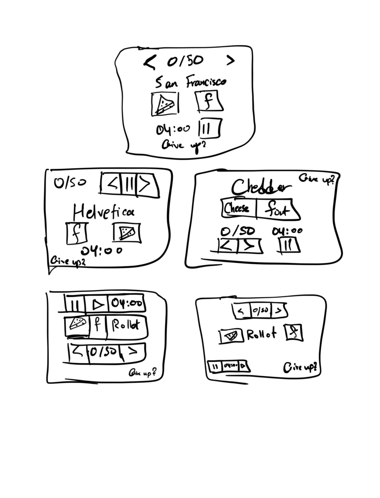
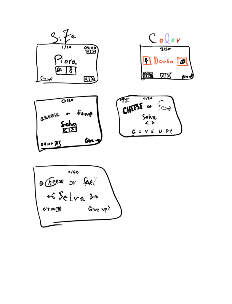
1.
Core Elements:
-Types of fonts and cheeses
-Score
-Control buttons (Give Up, Next, Previous, Timer, Pause)
Supportive Elements:
-Hints and instructions/informative text (“Enter C or F”, “Cheese or font?”, “It’s a cheese!”, “It’s a font”)
-Selection Highlighting (i.e., changing the background color and font weight of currently selected input field)
Extraneous Elements:
-Added “personality” comments when wrong answers are given (e.g., “For font’s sake, it’s a cheese!”)
-Random/in-cohesive coloring (e.g., of wrong answers as red, of input fields’ background color as gray when timer runs out)
2.
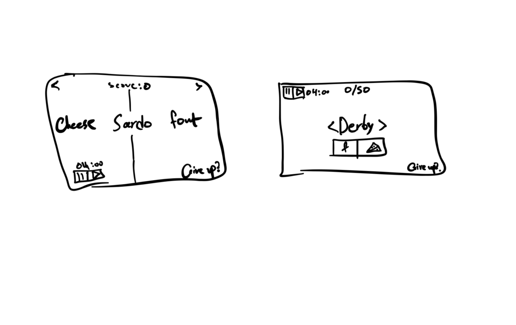
Exploring proximity in the design:
I believe that the elements should be grouped by purpose. For example, the timer pause and continue buttons should be close to each other and to the timer. In contrast, the give up button should be separate and because it acts as an “emergency eject button” that would exit the game. As such, it should ideally be in one of the corners of the screen, either bottom right if in text form or top left if replaced with an “X” icon. This is also similar to the score element! Moreover and after experimenting with different layouts, I think the next and back buttons should be next to/around the text as they control what shows up on the screen.
For analyzing a game, I chose Exploding Kittens.
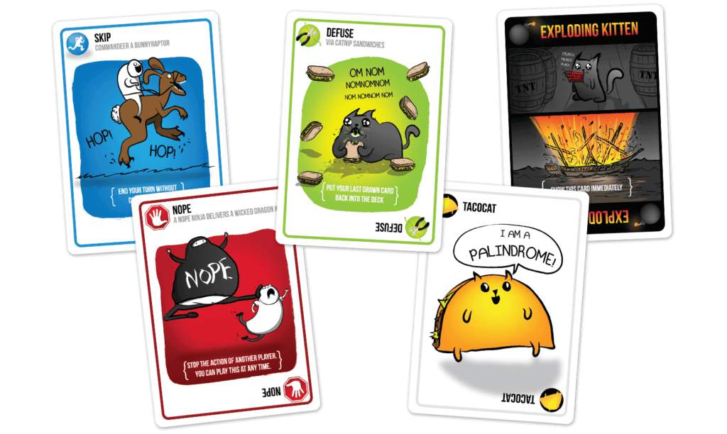
One of the reasons I chose Exploding Kittens is quite subjective I’d say: it’s the only game that I have come across that has not made me yawn or run away when seeing a card game. That said, I attribute that mainly to the design of the cards (Yes I find the design of the game to be more appealing to me than the actual game mechanics, sue me…).
One thing the designers of Exploding Kittens did that stood out to me is their use of icons and headings. The headings are in bold text and are accompanied by descriptive icons next to them. In addition, there are sometimes subheadings (colored in a light shade of gray) that have some quirky remarks. What makes this even greater is the fact they make great use of redundancy and include the same heading and icon at the bottom of the card.
Another major, and perhaps bigger aspect of the design, is the use of colors. Getting color right is certainly difficult, but I think the game designers nailed (especially when you look at the early prototypes when the game was on kickstarter)! They use primary colors (primary relative to their design system) as backgrounds (as well as in the icons) while allowing for the foreground of each card to be a different design. This is a helpful signal indicator for players because all you need to see is the most prominent color on the card and you can immediately tell what type of card it is and at the same time allowing people who want to admire the designs for those of us who get excited by seeing creative and unique designs (like me).
Not to go on too long but another thing the designers made good use of is negative space. For a game that has many moving parts, the cards do not inundate you with information that you may not want to see. This gives the cards a minimalistic design while also allowing for cohesive and aesthetically pleasing designs to occur on the card for the reasons mentioned before.
