

The game I chose to explore is Root, a board game I play often with my family that I think is absolutely gorgeous.
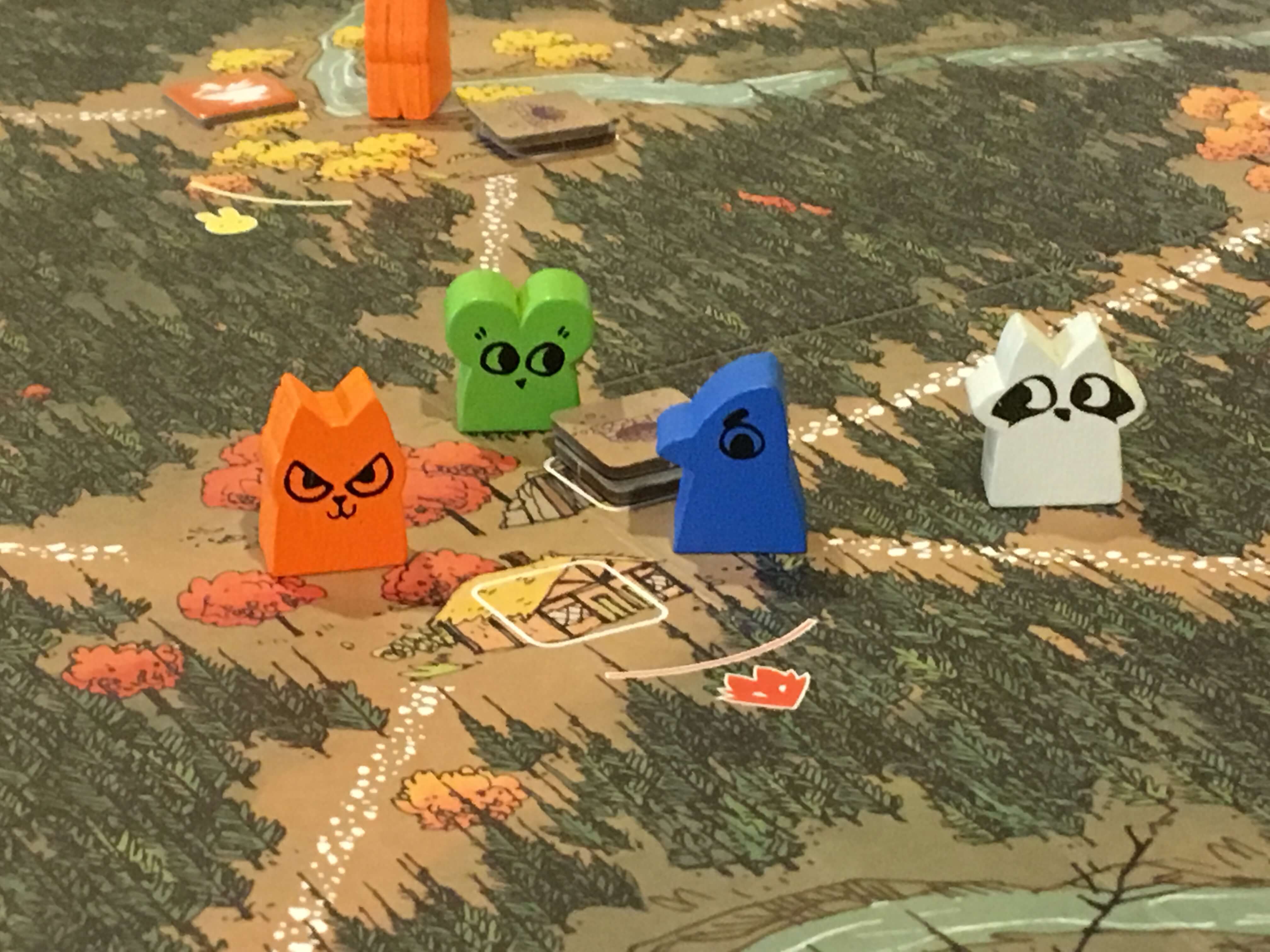
The premise of the game is that there are 3 factions; the cats, the birds, and the woodland creatures; that live in the forest and are vying for control of the area. The game uses colors fantastically for this game: each faction has different color meeples, tokens, and boards that make it easy to distinguish who is who. The illustration of the game is fantastic, bringing the story to life through gorgeous drawings and again using colors that contribute to a woodsy vibe.
Depending on which faction you play as, you will play the game completely differently with different mechanics for you turn’s play. Therefore, the visual design is extremely important in being able to communicate effectively what each player is supposed to act on and keep track of since each player is different.
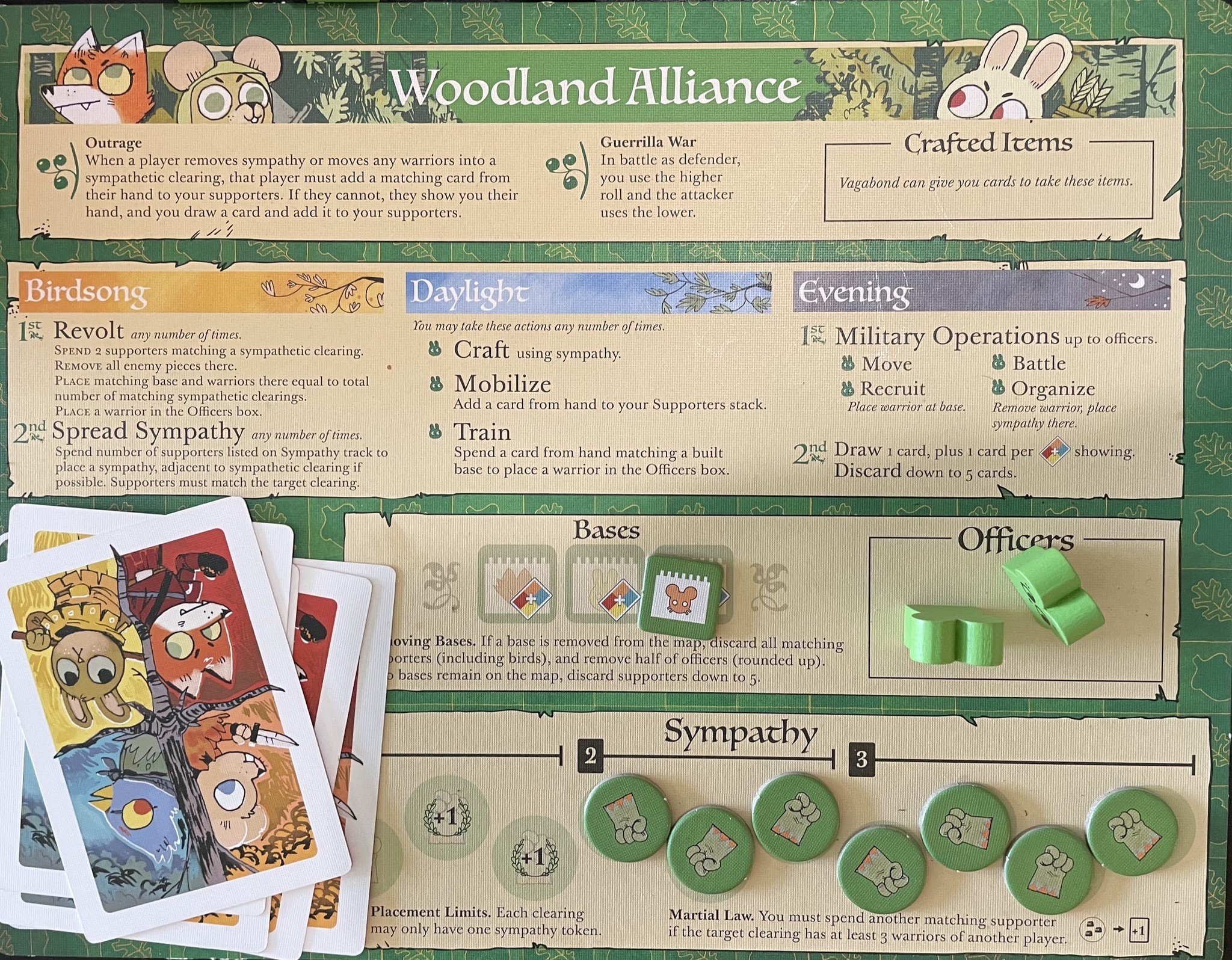
The above player board represents the faction I usually play as. While slightly overwhelming at first, the player board is a fantastic reference for everything a player might need throughout the game and is impressively packed with important information that is relevant whether you’re playing for the first time or need to clarify a rule during play.
The typography is great, using an artsy font for the titles but switching to a smaller and simpler serif font for all the detailed information. The use of proximity is also extremely important: Information about turn play is separated from associated spaces for tokens, meeples, and cards, and everything is labeled with both a clear title and more specific details. Again, the use of color is great to differentiate the 3 stages of turn play as well as to reinforce this player’s color: green.
