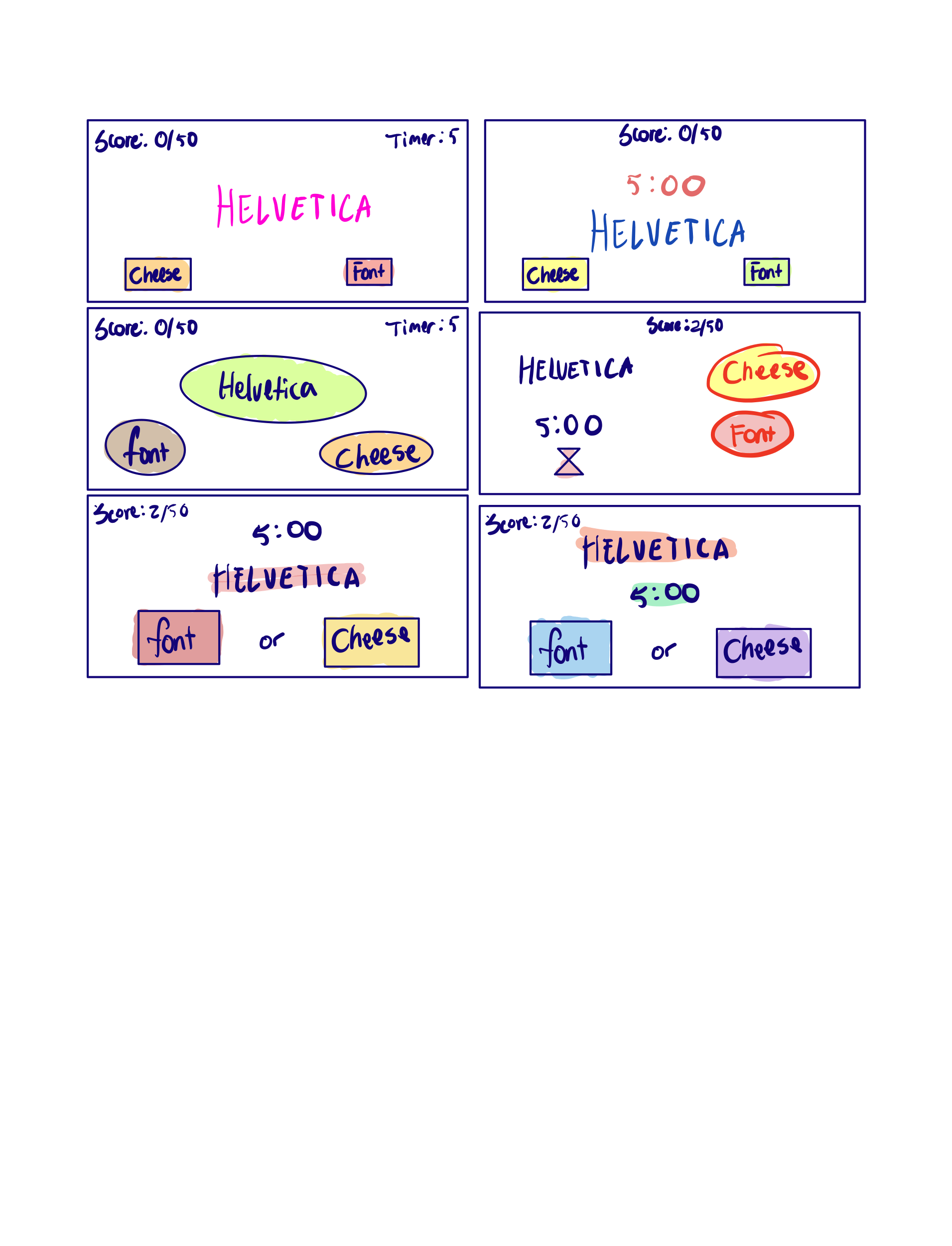
Elements of Cheese or Font
Core
- Score
- Cheese/Font Labels
- Text box
- “Previous” and “Give Up” Buttons
- Timer
Supportive
- Instructions for playing the game
- Hints
Extraneous
- Wrong choice buzzes and hints
Thumbnail Sketches
Colors, Shapes, Size
Proximity
I changed the formatting and spacing of the score, timer, and label to reflect differences in graphic design principles between each pane. I varied the size of the label, location of the timer, and size of the buttons to click on, as well as the shape.
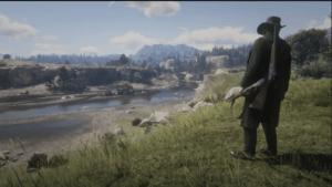
Games I Find Visually Appealing
I really enjoyed playing Red Dead Redemption 2, in part due to its graphics that immerse you into the game. Part of the experience is exploring the vast countryside, and the visual design principles they used in the game were incredible for encouraging people to explore. The game designers based their visuals around the theme of backcountry living and encapsulated it within the graphical elements they chose. The biomes and environments strewn across the land is incredibly beautiful to see!