Cheese or Font Elements
Core elements:
- Names of cheeses/fonts
- Score
- Timer
- User answer input (cheese or font selected)
- Right/wrong feedback
- Instruction to type “c” or “f”
- Fun facts about the correct answer
- Next/Previous buttons (aren’t needed if you type “c” or “f”)
- Give up
- Pause button
Thumbnail Designs
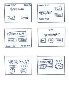
Size, Color, and Typography Thumbnail Designs
I played around with the alignment more in the second iteration of thumbnails, and tried to make the buttons align with the size of the presented word (“Verdana”) so they visually make a block together – I think this works particularly well in the last sketchnote (bottom-right)! Keeping the presented font or cheese with the buttons to select was really important since they are the core mechanics of the game.
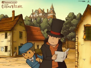
Beautiful Design: “Professor Layton and the Curious Village”
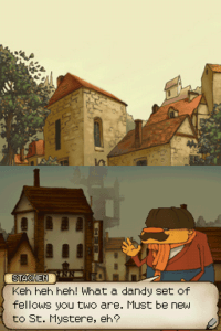
Although the game is a bit older (2007), I remember it standing out to me as a kid because I loved the character design and the incorporation of a more “physical” art aesthetic into the digital game. As you can see below, there is an almost watercolor/sketch look to the background that give the game a very warm and intimate environment. Because the game is set in a village, the color palette they use is crucial to creating that homey, small-town environment, while still maintaining an air of mystery (since it is a mystery game after all). The slight green undertones to the warm browns and yellows used adds just enough “spookiness” without leaning too far into cool colors, which would convey a very different message. With cooler colors, it would make the village much more lonely and scary looking, which would change the narrative environment the game constructs. still return to this game and always appreciate the attention to detail in the background drawings that create such an immersive environment!
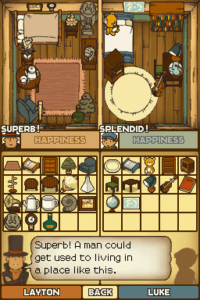
Additionally, I really appreciate how the character design really stick out from the backgrounds. The use of color and style of drawing helps the characters “pop” when you are searching to interact with them (shown on the right). The characters are more flatly shaded than the background, allowing you to identify interactive elements of the game. When you actually talk to a character, the background dims and the size of the character is increased so the character remains the focus of the screen.
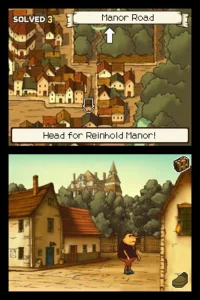
The typography used is also very reminiscent of old games, and they use a more analogue text for the “mini games” within the overall game, playing off of the association with more console-like text being used for games, like an arcade (shown in the third screenshot)! This also allows players to understand that these games are “extra,” and not essential to the core narrative of the game by using a different style of text and character designs (notice the more pixelated versions of the characters in the top part of the screen). I