


I chose Undertale as a game that I found beautiful. The simple graphic style of black and white makes all the elements stand out and emphasise the theme of the world below ground. The graphic design style is full of personality and expression: it is silly and at the same time quite elegant. The contrast of the black and white with a red heart aligns with the theme and makes it very easy to differentiate both the name and the symbol. Visually, the graphics in the game and on the thumbnails are vibrant, well-designed, and easy to pick out all the elements. The matching pixelated font and images also create a cohesive look.
________
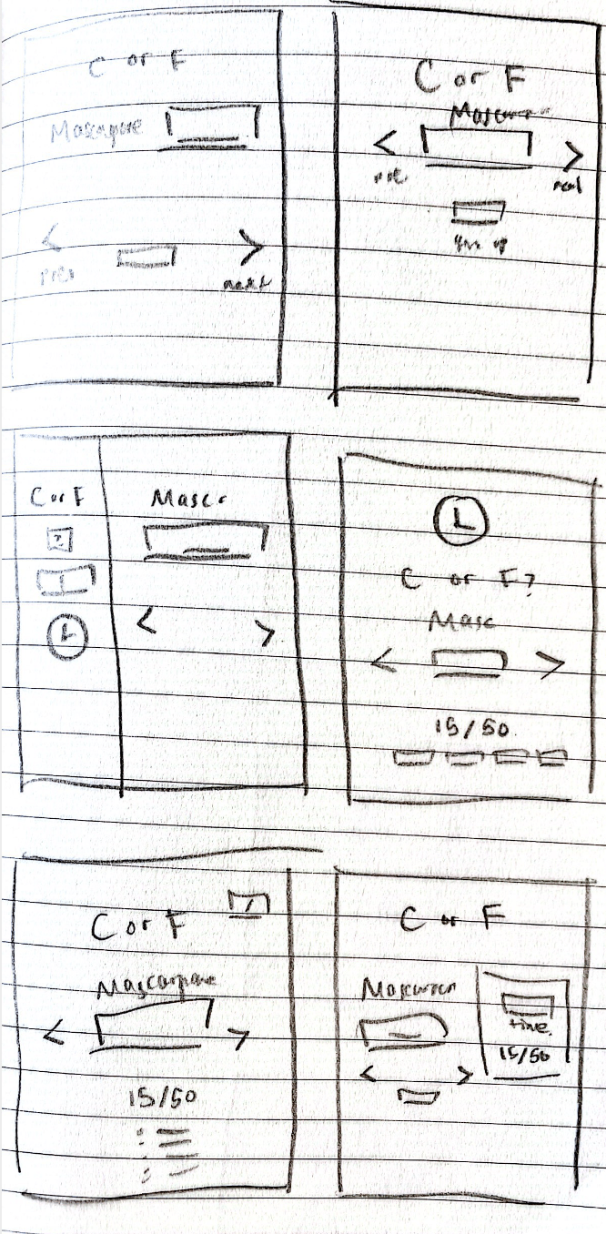
- Identify elements of cheese or font
- Core:
- Cheese/font labels
- Answer box
- Clock element
- Score
- Previous/next
- Give up
- Supportive:
- Instructions for answer
- Hints
- Extraneous:
- Comments about quality of answer if incorrect
- Colours indicating cheese or font
- Sketch out the core elements
-
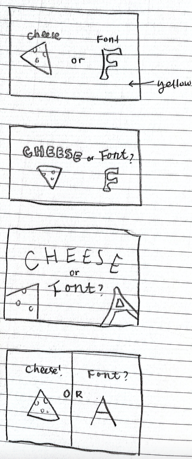
Make one element in a NEW thumbnail sketch HUGE. Try taking ONE color and using it in your thumbnail sketch along with black. Make 3–4 thumbnail drawings that use type in different ways. I used different type for the cheese and the font, a sans serif and serif.
-
Explore proximity in your design (short descriptions answering the questions is ok). I explore the idea of putting the cheese and the font farther from each-other in order to emphasise the “or” aspect which is the key idea of the game: comparison. I further try to make the cheese and the font take up half the thumbnail size in order to distribute the space evenly.
