

1. Identify elements of Cheese or Font
Core elements:
- The prompts (names of the cheeses and fonts)
- The question “Cheese or font?”
- A way for the player to enter their answers
- Feedback of whether the player was correct or incorrect after each answer
Supportive elements:
- The instructions “Enter C or F”
- The indication of the current score
- The timer
- The pause button to let you pause the timer
- The “Give Up” button
- The “Previous” and “Next” buttons to let you answer the prompts out of order
Extraneous elements:
- The format of the questionnaire as a two-column chart
- The colorful interface (orange for prompt backgrounds, yellow for answer backgrounds, black for correct answers, red for incorrect answers)
- The elaborate error messages as opposed to simple “correct” or “incorrect” messages
- “Also try: Cheese or font? II”
2. Thumbnail sketches for Cheese or Font
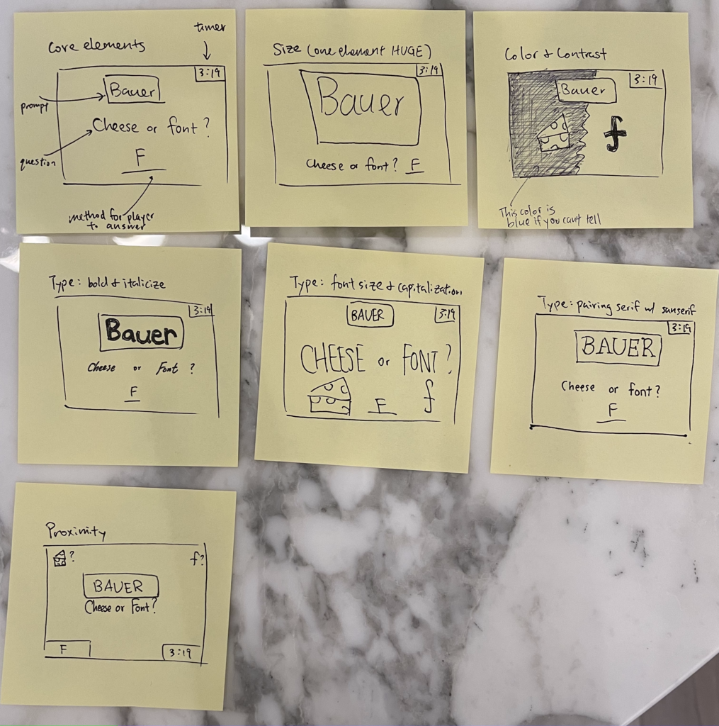
Figure 1. Thumbnail sketches for redesigning Cheese or Font.
- Sketch out the core elements (Figure 1 top-left)
- Make one element in a NEW thumbnail sketch HUGE (Figure 1 top-middle)
- Try taking ONE color and using it in your thumbnail sketch along with black (Figure 1 top-right)
- Make 3–4 thumbnail drawings that use type in different ways (Figure 1 middle row)
- Explore proximity in your design (Figure 1 bottom-left): I grouped the prompt and question together by placing them close to each other concentrated at the center. Then I grouped the other elements (timer, blank for the player to type their answer, etc.) together by placing them at the corners of the screen.
3. A game I think is beautiful
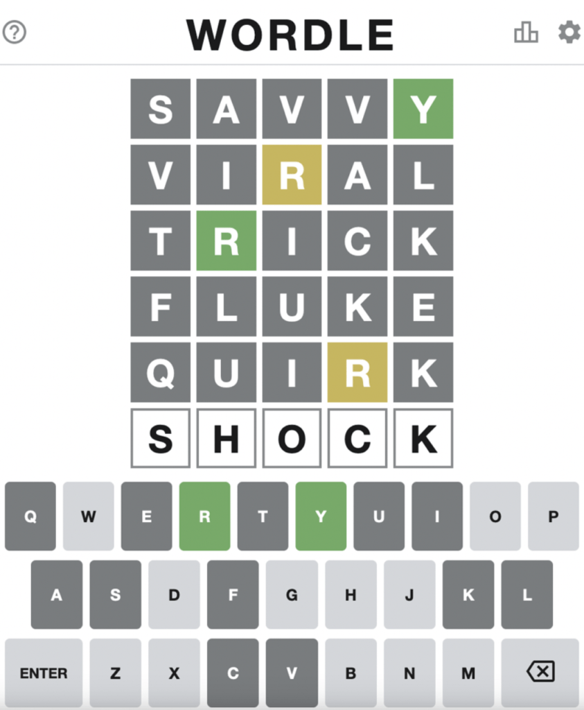
Figure 2. Screenshot of Wordle.
- I think Wordle is a beautiful game that utilizes good graphic design principles. The core elements of the game are the six five-letter rows, the keyboard for user input, and a way to indicate the three different types of guessed letters (correct and in the right spot; correct but in the wrong spot; incorrect).
- For the six five-letter rows, the designer cleverly made all the letters capitalized, which contributes to a sense of consistency, connoting that all of the 30 letters are weighted equally, which they are.
- The keyboard is all capitalized too, which visually matches the type of the grid above, contributing to even more consistency.
- The designer used three colors (green, yellow, and dark gray) to indicate the three different types of guessed letters. The colors are beautifully chosen to complement each other, with green connoting “correct” yellow connoting “almost there,” like in a traffic light. But instead of using red for wrong (which may be too strong and frustrate the player), the designer simply chose a dark gray, conveying a message more like “good job on eliminating this letter” rather than a blunt “incorrect.”
- Aside from the color palette, the design also uses proximity and alignment (the grid elements are close to each other) to group things together, making it clear that the grid is the grid and the keyboard is the keyboard. Furthermore, the corners of the grid are sharp while the corners of the keyboard buttons are round, which visually separates them and makes it easier for the player to notice that they are two distinct elements.
