

When playing Cheese or Font, I identified the following elements of the game.
Core elements:
- Font/cheese names
- Text input field
- Score
- Timer
Supportive elements:
- Feedback on input (correct or incorrect)
- Table of past guesses
- Pause button
- Previous/Next buttons
Extraneous elements:
- Ads
- “Give up” button
- Long sentences for incorrect guesses
- Quiz stats (average score and your score)
Thumbnail Drawings:
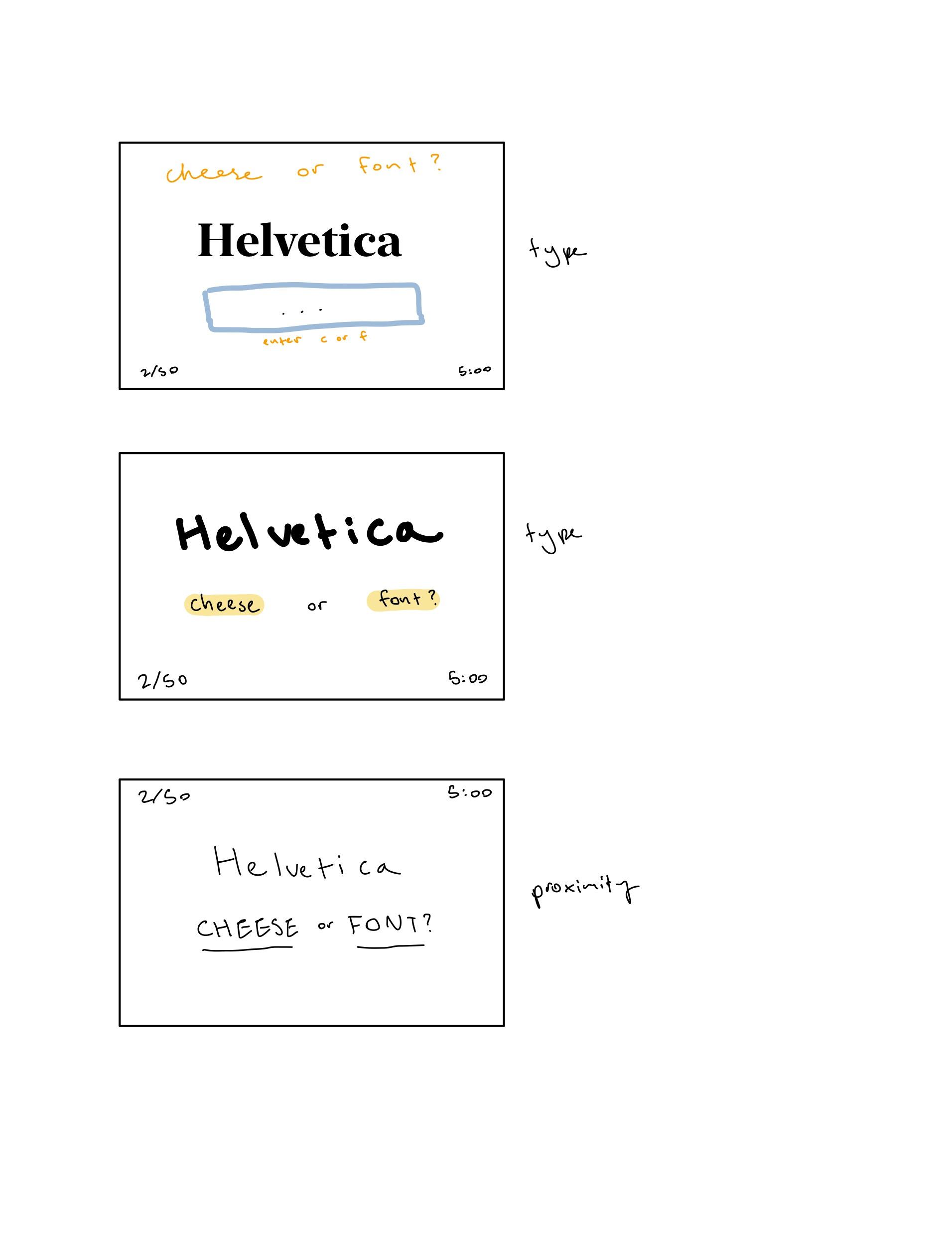
I began by making the size of the cheese/font name very large, since that’s the most important thing for the user to see. I do think, however, that the cheese/font buttons are equally important and in a final version I’d make them larger as well. Next, I worked on using a single color (orange, for cheese) to emphasize the cheese/font word. I kept the buttons in black for contrast; I quite like how clean this design is. My next three attempts experimented with type. In the first, I mixed serif and sans serif fonts, which in such a small space looked quite busy. In the next design, I mixed typeface with a smaller, handwritten type which helped to draw attention to the main word and link together the handwritten instruction text. The final version was all handwritten but with varying thickness: I enjoyed the consistency of this design. Finally, I used proximity in the final thumbnail by pushing the buttons close together. While this was effective in grouping together the two buttons, I felt like it looked busy overall. 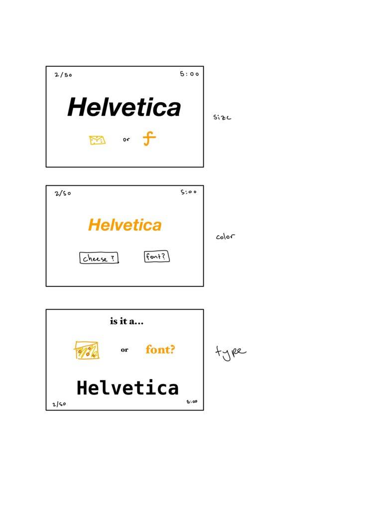
Beautiful Game: Wordle
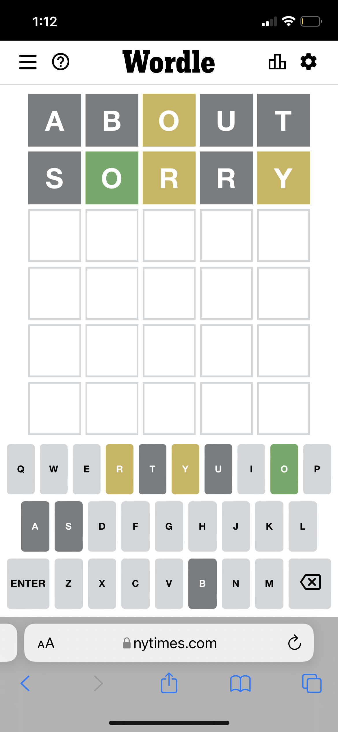
While it’s simple, I think the design of Wordle is appealing and effective. I see several design principles employed here.
First, color is used very intentionally: before you begin playing, the entire board is grey. The colors yellow, green, and dark grey are used to mark player choices and results. It’s extremely clear from a glance which letters are in the word or not, which makes it easier to make new guesses.
I also see that Wordle uses a more bold/fun font for their top logo (“Wordle”) and a simple, sans serif font for all of the letters on the board. I think the choice to keep the type consistent between the bigger and smaller letters, and using size to differentiate instead, creates a clean look. The use of size here is helpful: the guesses (and results from guesses) are much bigger since they’re what the user will be looking at the most.
The keyboard letters at the bottom are all extremely close together, which groups them as a set of options through proximity. There is very little spatial separation between the keyboard and the guesses above; if I were to improve this design, I might add more white space to differentiate the two.
