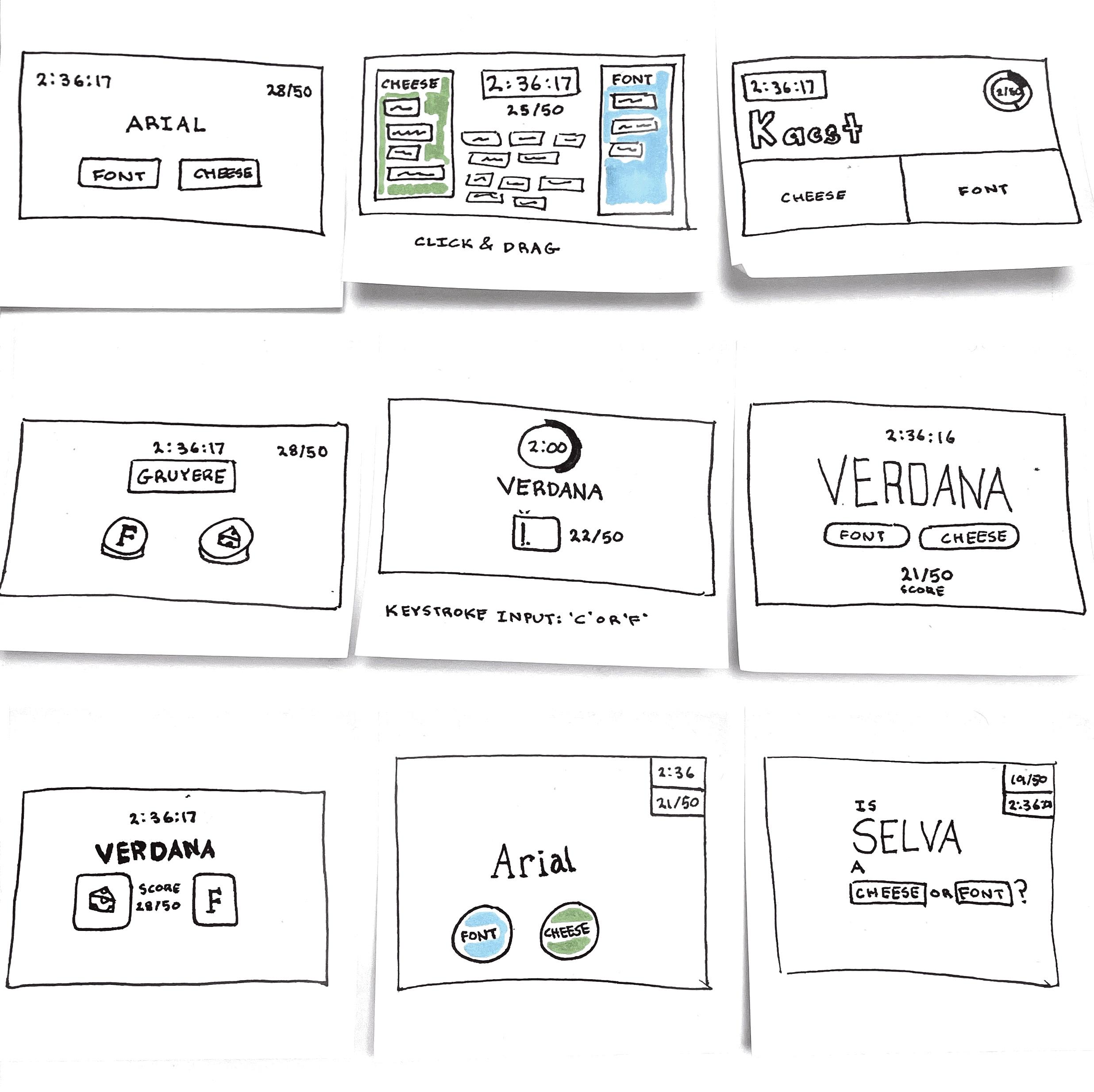
Elements of ‘Cheese or Font’
Core
Timer
Start Button
Cheese/font name
Mechanism to input answer
Score
Support
Feedback after each answer
Table labels (‘Enter C or F’)
Extraneous
Switch to stopwatch
Score as percentage
Color choice
Buttons to cycle through input fields
Answers in table format (even though that’s sporcle’s thing)
Pause button on timer
Average score
Quiz stats & replay button
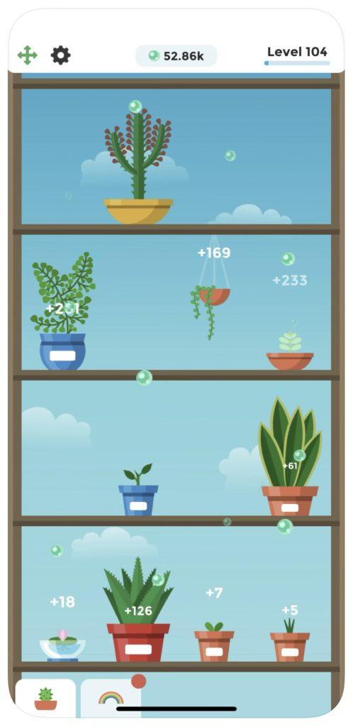
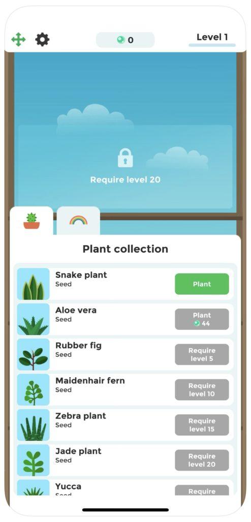
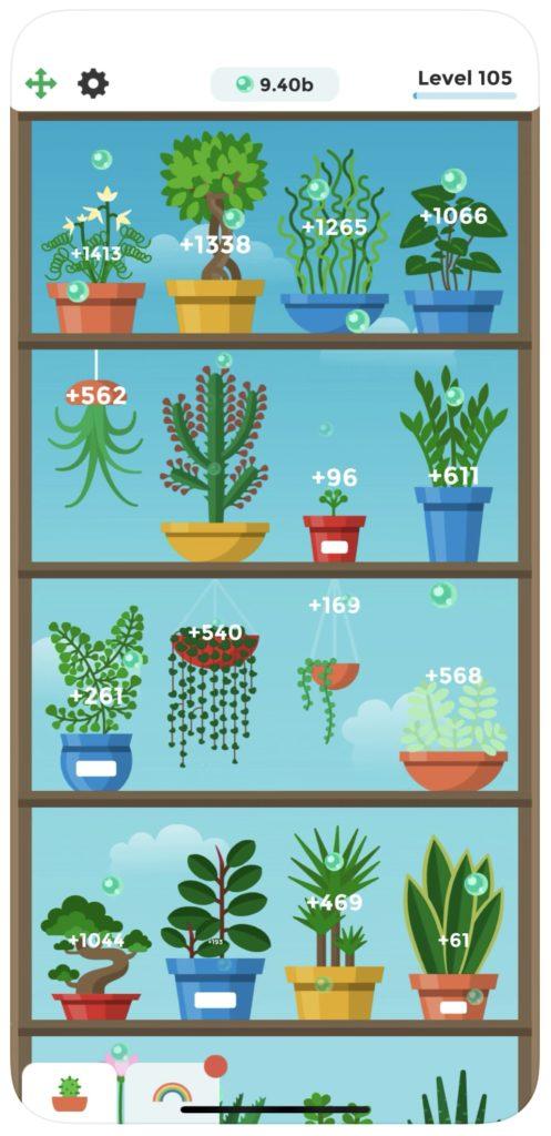
Beautiful Game: Terrarium
One game I find visually stunning is Terrarium, a simple game in which you take care of plants and grow your garden. I’ve always appreciated this game for its ability to present so much information in a way that presents itself to the user as calm and fun, when it so easily could be chaotic and overwhelming. It does a good job using proximity to chunk information: the information that absolutely needs to be seen is presented in the top bar and never changes. Information that is less crucial, however, is presented delightfully, with the amount of oxygen each plant creates floating serenely upward from the roots until it fades away. The sans serif typeface the game employs is friendly as well, with circular bowls and smiling ‘e’s.
Their choice of palette also contributes to the delightful UI—the plants and pots come together to form a cohesive rainbow that’s pleasant but not distracting. Colors also clearly signify the affordances they represent, with bright green CTAs and legible disable states. Colors also are rarely repeated, allowing the player to quickly navigate the screens and modules based on their color alone.
Another way they introduce structure and reduce clutter is by maintaining a strict grid system, with plants only ever occupying one of four spaces on each rack.