

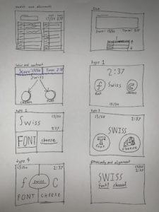
Cheese or Font
Elements
Core elements
- Timer display
- List of possible cheeses or fonts (and their corresponding answers)
- Score display
- Start button
- Text field for inputting guesses
Supportive elements
- Pause button
- Give up button
- Replay button
- Prev / next buttons
Extraneous elements
- Comments
- Bookmark button
- Add to playlist button
- Embed this quiz button
- Quiz stats
- Puns presented for wrong answers
Thumbnail sketches
Thomas was Alone
For my game, I chose Thomas was Alone. In Thomas was Alone, the player controls a simple red rectangle named Thomas as he tries to navigate through different puzzle rooms. Along the way, Thomas befriends and gains the help of different rectangles, each with a unique ability and a unique color and size to differentiate them.

The designers use color extremely effectively in the game. Because the game is so minimalist in color — all walls / barriers are simply colored black — each rectangle stands out sharply, making them very easy to see. Furthermore, given the sparse colors, each color stands out from each other. This lets the player easily see where the different rectangle players are and helps when quickly switching between them to solve different puzzles. The color also serves the additional purpose of helping to lend personality to the different rectangles — each color signifies a different personality or mood. For example, one of the rectangles is scared and is colored a light blue, whereas the more vibrant yellow rectangle has a strong and outgoing personality. In sum, because the colors are so sparse and so carefully chosen, the player is able to differentiate the rectangle players from the background quickly and to connect each rectangle with a different personality.
The game designs the player rectangles to seem small compared with the massive walls and obstacles surrounding them. This gave me a sense of foreboding and loneliness as I played, and this helped to draw me to each individual rectangle’s personality. The game always situates the players near the center of the screen, which both helped me focus on the players as well as gave me a sense of the world sprawling out around them. On the bottom right corner of the screen, there is a small info bar which shows which rectangle the player is currently controlling as well as which rectangles the player has available to switch between. This simple proximity design allows me to focus easily on the gameplay — I know that the players are always centered and that the info is far away in the bottom right corner, where it doesn’t interfere with the gameplay experience.
Occasionally narration will display on the screen. This typically describes what the different rectangles are feeling as the player progresses through different puzzle rooms. The narration is meant to be simple and to convey feeling more than plot, and so a single sans-serif font is used for all narration. The sans-serif gave me a feeling of simplicity and the use of a single font gave me a feeling that the narration was a single stream of consciousness, which may have been what the designers intended. The text is always colored white, to contrast it against the black background and make it easy to notice and read.
