Cheese or Font?
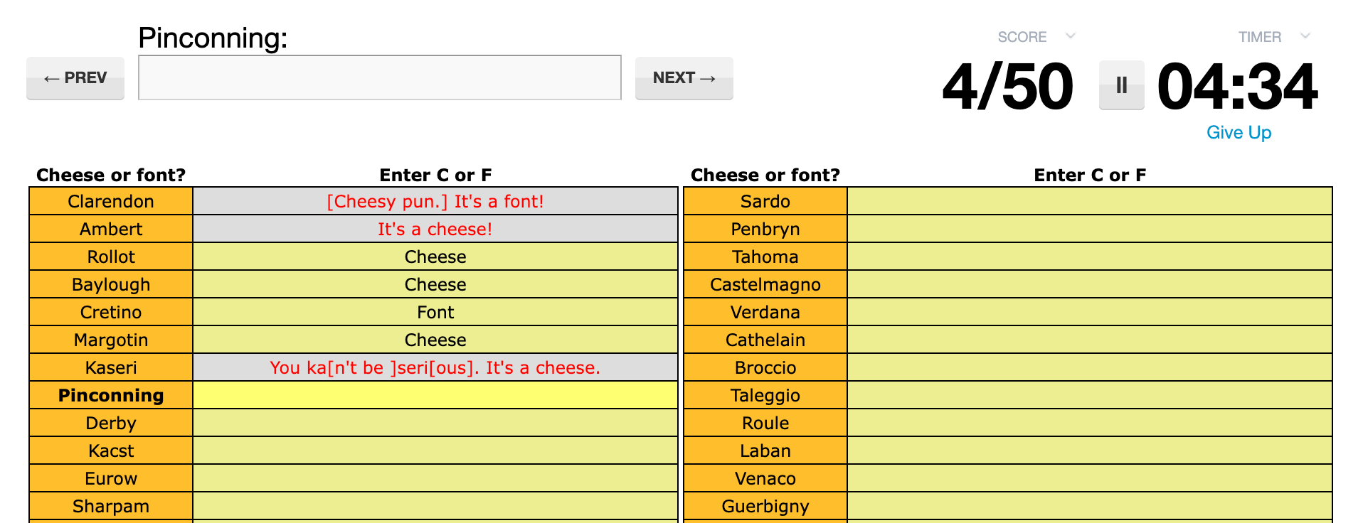
Playing Cheese or Font was… a more infuriating experience than I expected it to be. How could I not know the cheeses and fonts? Is knowing “gouda” not good enough?
In this 5-minute game, you’re given 50 fancy names. Your task is to decide whether each is the name of a font or a cheese. The elements of the game are:
Core:
• play quiz button must be pressed to enter anything
• the names of the cheeses/fonts + the column label “Cheese or font?”
• the column in which you enter your answer + the column prompt “Enter C or F”
• the timer
• the right/wrong judgement that gets revealed after every turn
Supportive:
• more info button with the error symbol that shows you to enter C or F
• forced order icon that tells you answers must be entered in order
• the by-answer changing score display
• the current font/cheese being bolder when playing
• option to pause the game in the middle of play, which also pauses the timer
• the “give up” button
Extraneous:
• link to also try Cheese or Font II
• the orange and green colors as a means of distinguishing the columns
• the cheeky, personal error message that each wrong answer prompts
• Correct answers showing up as you go as just “Cheese” or “Font”
Graphic Design for Game Designers
Cheese or Font launched me into the exercises for “Graphic Design for Game Designers” by Christins Wodtke. These exercises challenged me to narrow the most important information, then represent it in a “thumbnail sketch”: neat, simple, and visual.
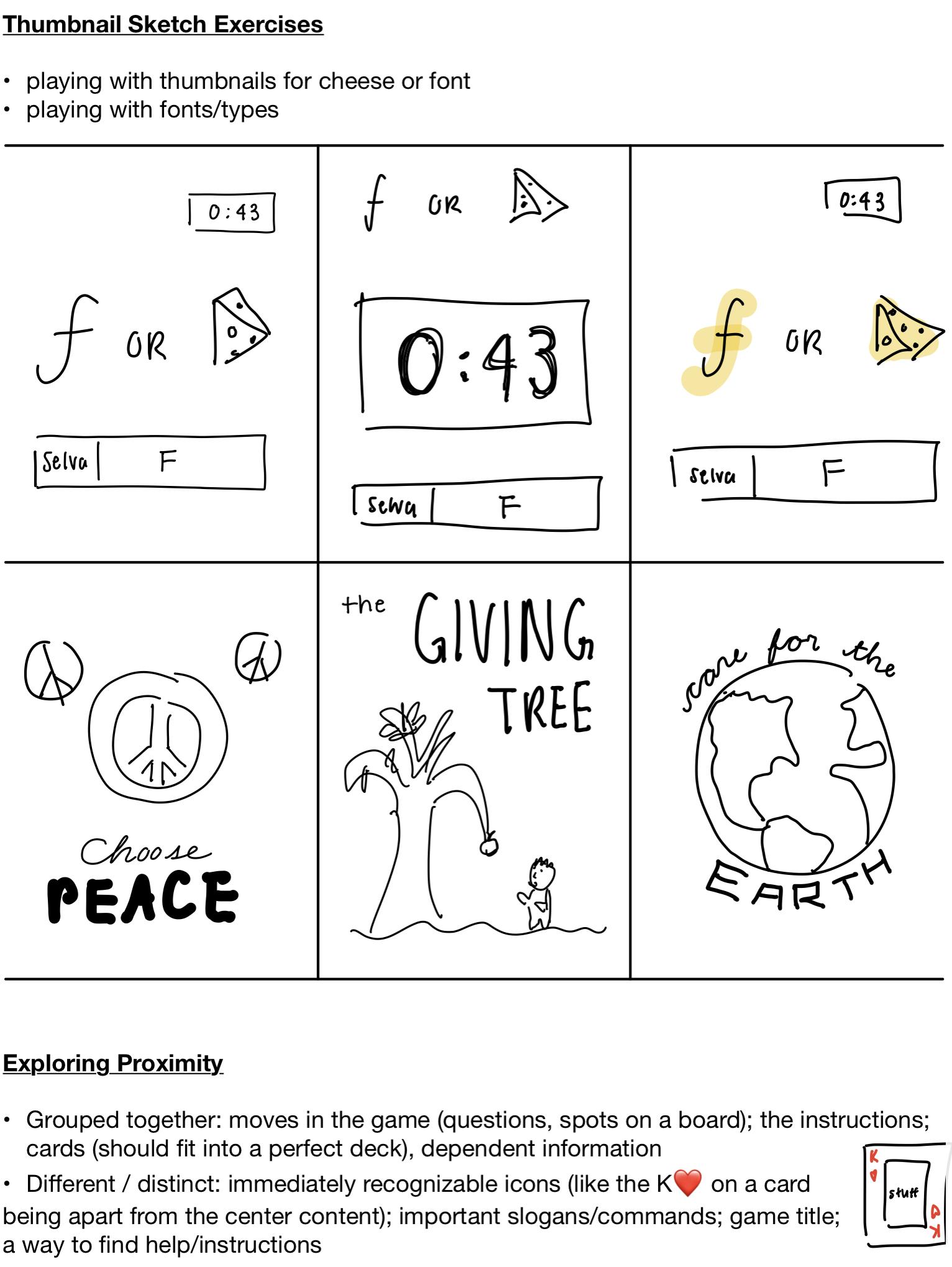
Redesigning Font or Cheese

Applying what I learned from the article, here are some things I would change about the graphic design of Font or Cheese:
- Size: the font height of the score and time remaining look about 4x as tall as the names of the fonts/cheeses, which is the most important thing I need to read as a player. It’s fine that the score and time are big, the names of the fonts/cheeses have to be bigger. This will also help so players don’t have to strain their eyes.
- Contrast: this is attempted by the orange and the chartreuse/green. I can tell that names are in orange and my answers are in green. But it’s so harsh on the eyes! I would change the chartreuse to a very, very light orange color to show difference through darkness/light rather than color. The orange and chartreuse are also too close in brightness and could be confused for colorblind users.
- Type: maybe this is more the fault of the website than the game creator, but the font pairing is incompatible: the game title is in a fairly slender sans serif font and the names on the game itself are in a wider, shorter sans serif. I would use a serif type for the names on the game itself.
- Proximity: more space between “Cheese or font?” column header and the content of the column. also more space between each row in the table — it’s too hard to read from one name to the next right now.
- Consistency: the pop-ups appear differently — the “More Info” pop-up is brought up by clicking a button, whereas the “Forced Order” and “Wrong Answers” pop-ups are brought up merely by hovering the mouse over the icon.
Something beautiful to close this post…
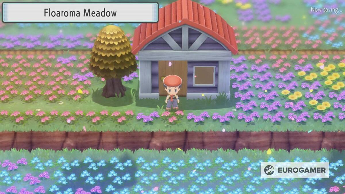
This is a screenshot from Floaroma Meadow in Pokémon Brilliant Diamond (the “Eurogamer” tag at the bottom right is simply the player’s watermark). Beautiful!
Yes, the colorful flowers give this screenshot of the game an unfair advantage, but let’s take a closer look at what brings the serenity to this photo:
- Size: text size of the upper left is almost as big as your human sprite, clearly readable.
- Contrast: the different ledges/levels of land are distinguished by a dark brown. In the game, you can’t walk across a ledge — you must take a staircase or a ramp or some sort. The dark brown reminds you of this.
- Detail: notice how no two flowers are the same: the blue flowers have their own design, the yellow flowers have their own design, etc…
- Type: a sans serif font for a header-style pop-up in the upper left that reads “Floaroma Meadow.” The x-height of the font is a little low, but otherwise fine because there is no other text on the screen that’s part of the game.
- Proximity: the house is the only building in this entire screen, and it’s importance is emphasized by how it stands alone. The tree is also a standout; in the game, these trees are helpful because you can lather honey on them and attract Pokémon! Its singularity and location emphasize its importance.

