

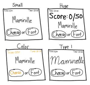
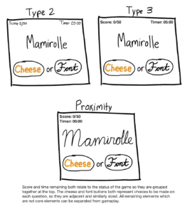
Cheese or Font Elements
Core:
- Names of cheeses/fonts
- User input
- Score
- Timer
Supportive:
- “Enter C or F”
- Next/Previous buttons
- Correct/Incorrect feedback
Extraneous:
- Jokes when answering incorrectly
- Give up button
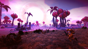
No Man’s Sky is a game that I think is quite beautiful. The game is one of the most visually appealing games I have ever played and for me, the graphics of the game are what make it most enjoyable.
The game makes great use of design principles including vibrant colors/contrast and dynamic sizing. In the screenshot, the player is on a planet with a bright pink-focused color scheme that really pops out at the player. Different planets have very different features and color schemes which makes for interesting contrast and keeps exploration exciting. Additionally, sizing plays an important role in making the game beautiful as the game is based on exploring and surviving in an open-world universe, traveling between planets. The player, comparatively, is very small and this is emphasized in the above screenshot. The relative sizing of the players and objects compared to planets and the vast universe makes the game feel extraordinarily immersive.
