

Design Exercises for Cheese or Font
- Identify elements of cheese or font
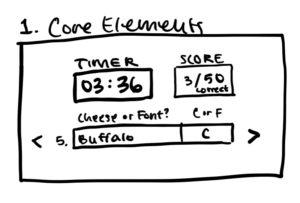
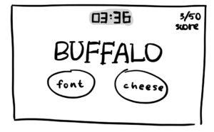
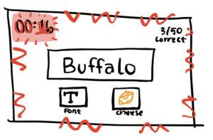
- core elements
- timer
- answer boxes for each cheese / font
- scorekeeping device
- previous / next buttons and forced order of items
- supporting elements
- hints
- give up
- extraneous elements
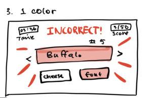
- cheeky comments when you get a guess wrong
- core elements
- Sketch out the core elements
-
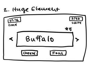
Make one element in a NEW thumbnail sketch HUGE.
-
Try taking ONE color and using it in your thumbnail sketch along with black.
-
Make 3–4 thumbnail drawings that use type in different ways
-
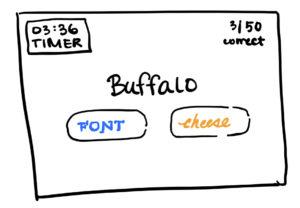
Explore proximity in your design
- I made sure that the font and cheese were always similarly sized and located close together to reflect their parallel usage in the game. I made sure to keep the guessing word centrally located and largely sized to symbolize how central it is to the gameplay. I kept the timer off to the top, side or corner, and medium or small sized so that it would not draw too much attention away from the main attractions of the game. In many of my thumbnails, I spaced out the scoreboard and the timer to reflect the graphic design principle of balance.
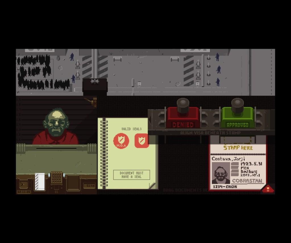
Visual Analysis of Papers, Please
Assignment: Pick a game you think is beautiful, take a screenshot and explain what graphic design principle(s) they used to make it great.
For this assignment, I chose the game Papers, Please, in which you must survive and support your family as a border inspector in a pixelated fictional Soviet-style communist country. Each day, you must go to your job and decide who to admit or deny from the country’s border while also navigating bribes and threats. This game uses visuals to make its story more compelling. It draws from a very limited color palette, using mostly greys, grey-blues, and pops of red, green, and yellow to create very dystopian and soviet-looking scenes. This color palette also allows the player to easily navigate the inspector’s table, which gradually grows more complex as you are provided with an x-ray machine, magnifying glass, thumbprint check, etc to do your job better. Also, since your job is to distinguish fake passports from real ones, font, size, and placement actually play a huge role here; forged passports sometimes look very similar, and the only difference may be a handwritten-looking font to show that it is forged and not real. Overall, these elements of graphic design help this game be visually appealing and really fun to play!

