

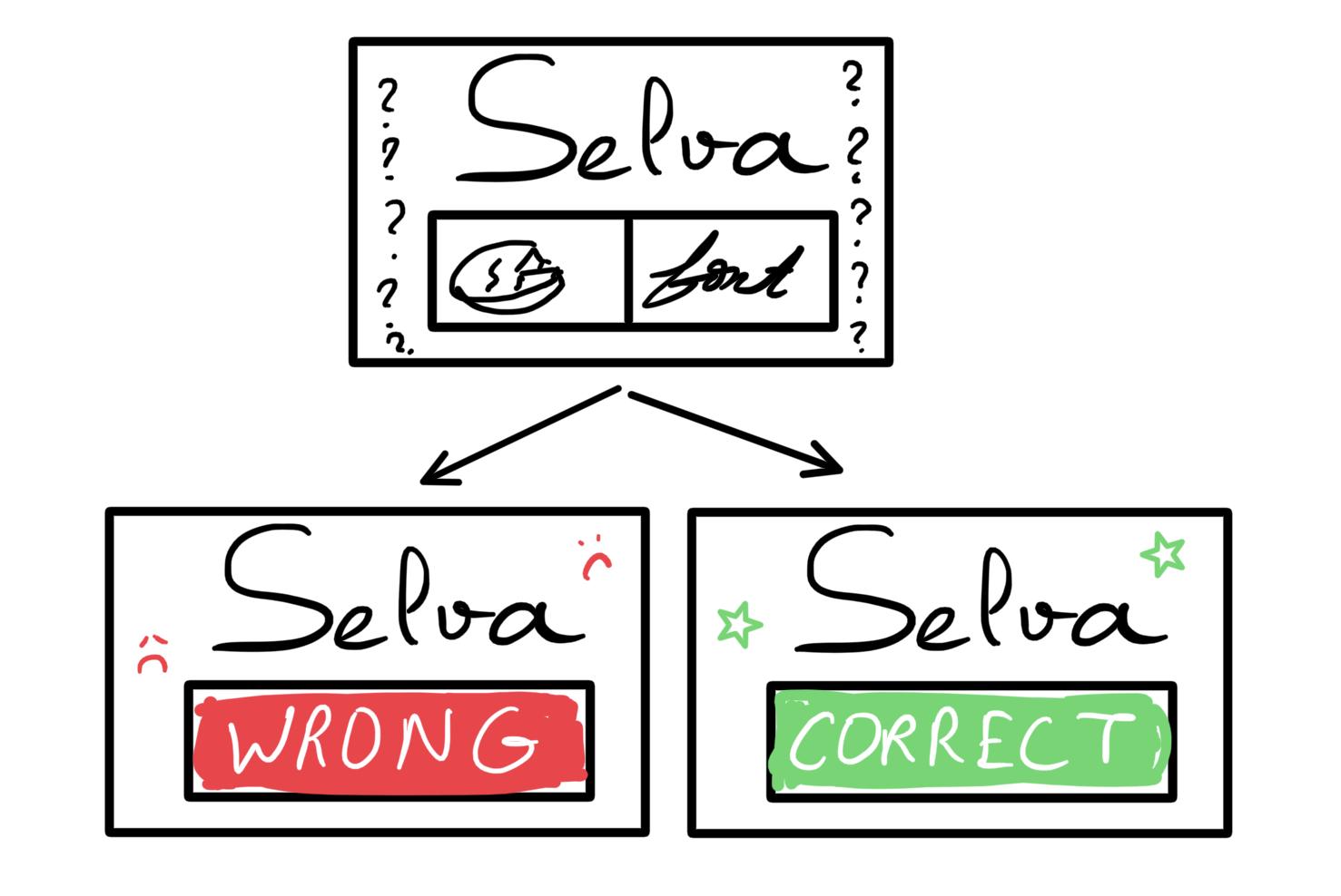
Exercises:
- Elements of Cheese or Font:
- Core: Text input area to answer – Says if you answered right or wrong – Name of cheese/font
- Supportive: The next and prev buttons – The give up button – the timer
- Extraneous: Ads – Having to press Play quiz to start – Having the whole table displayed
- Small quick sketch:
- Thumbnail exercises:
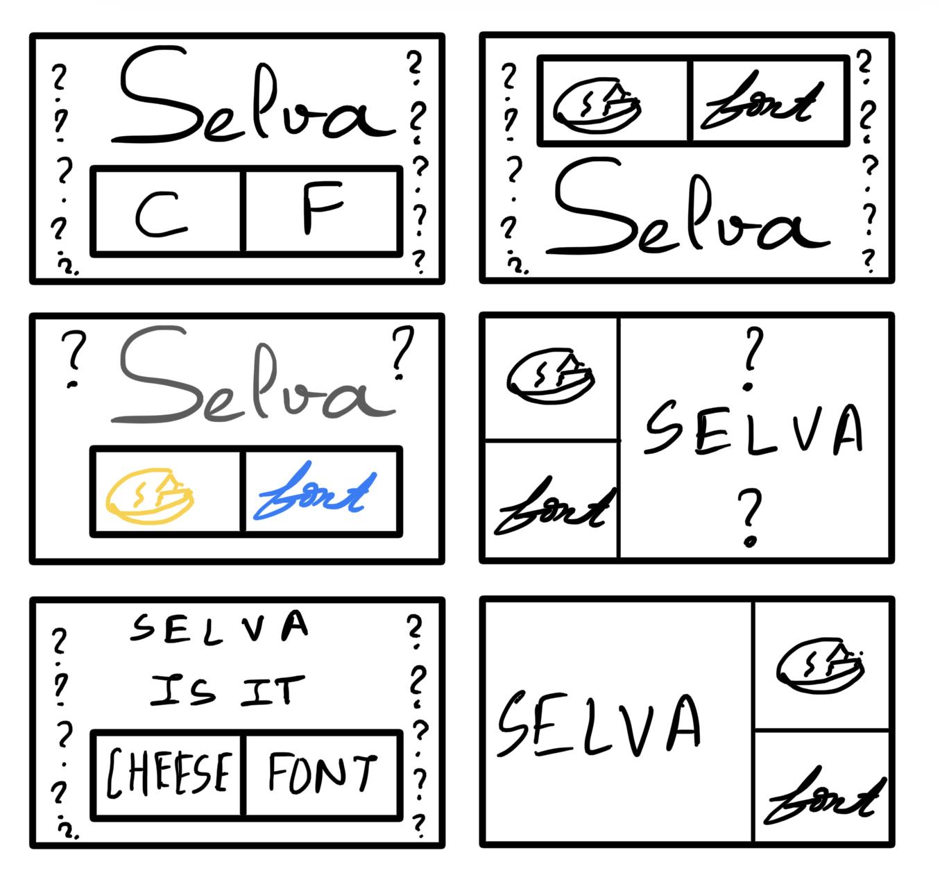
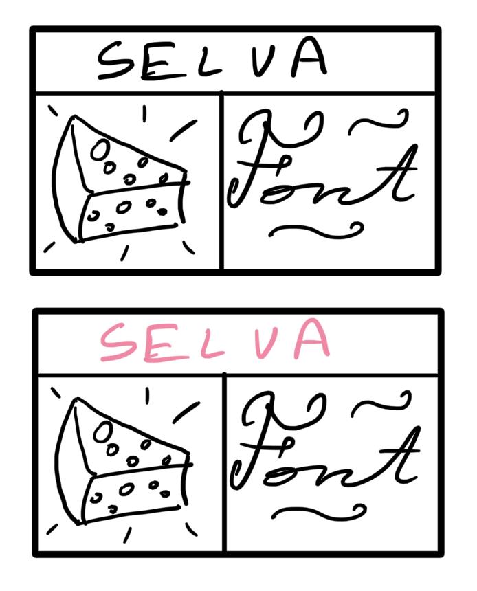
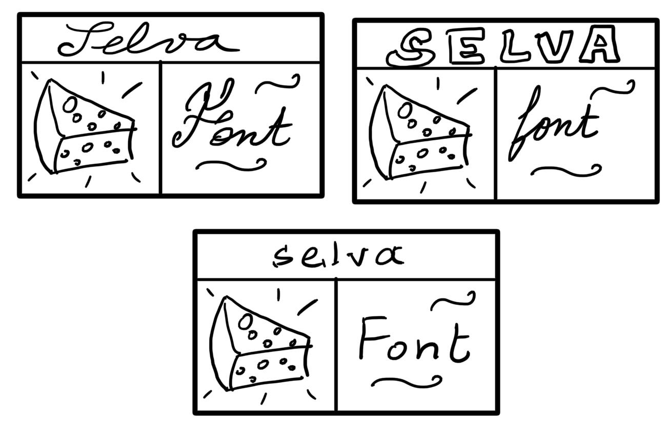
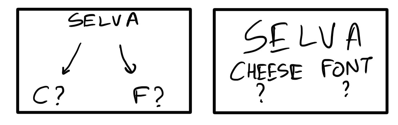
- Proximity description: I think the names are overwhelming and adding more space makes it looks better and cleaner.
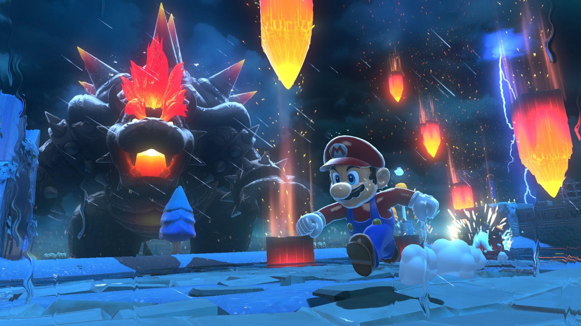
I think the game “Super Mario Bowser’s Fury” made a few graphic design decisions to create a beautiful game. A new aspect of this game is sizing. They let you play with size and in the screenshot above you can see the contrast between giant angry Bowser and little Mario trying to survive. The use of color also makes the game beautiful. In the moments when Bowser is furious, the theme goes dark with small pops of bright red fire. The contrast is beautiful and informative as it helps when playing to know how to avoid obstacles.
Throughout the game, they mainly use sizing contrast along with picking consistent and pretty color palettes for the game. The choice of color is also important in the sense that it conveys feeling. In the above screenshot, the colors convey fear and chaos which is consistent with Bowser rising to destroy the cat village. In other times of calm and peace, the sky is blue and the color palette used reminds you of a calm beach day. One more extra thing used in this game is being able to play as cute characters. You can play as a cat (or raccoon?) and as a squirrel. These new characters were new for Mario games.
