

Here are the components that I identified in Cheese and Fonts:
Core:
- Score
- Timer
- Cheese and font names
- Input system for player answer
Supportive:
- Table labels
- Information on right or wrong answer
- Input area label
Extraneous:
- Ads
- Links to other quizzes
- Next and Previous buttons
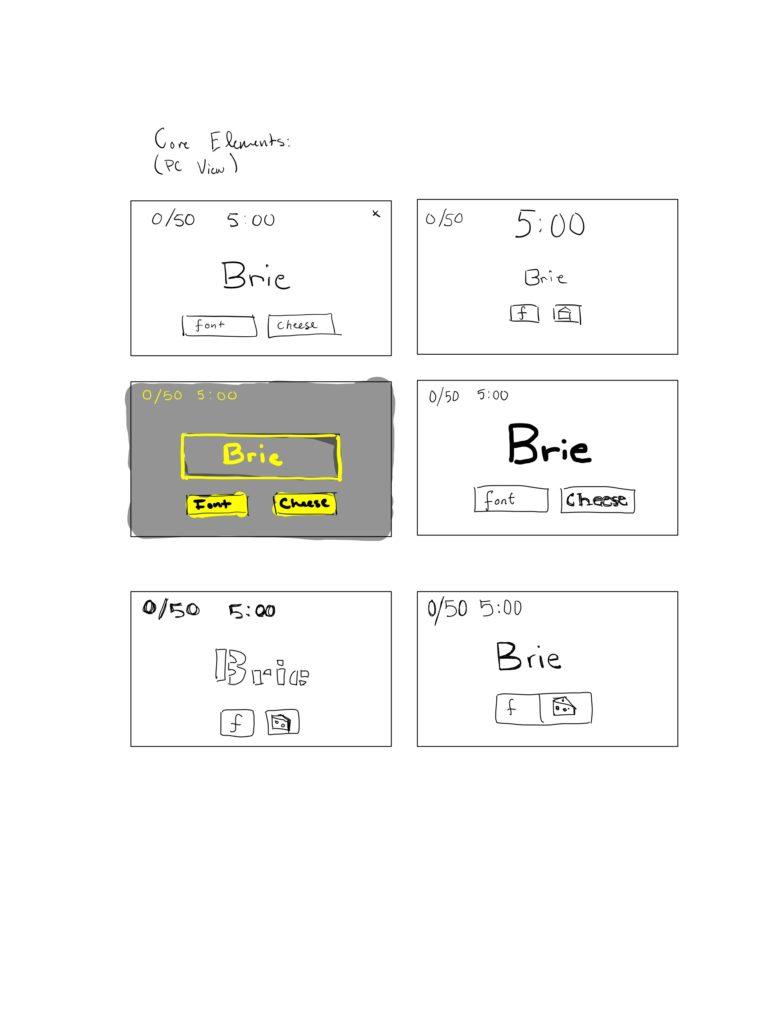
What should be grouped? What is different and should be separated from gameplay?
The buttons should be grouped together, as they are both used to answer whether the current name on screen is a cheese or a font. The timer and score can also be grouped together, as they are keeping track of the user’s progress. However, the timer and score do not play a direct role in gameplay, and as such should be separated from the name and answer buttons.
Now, I’d like to talk about Journey, a game I find quite visually pleasing.

The choice to remove any tooltips, HUDs, and other unnatural looking artifacts from the player’s view is both part of the challenge of playing the game, while enhancing its visual appeal. It’s not just the HUD – the general aesthetic of the game itself is stark and barren, characterized by the desert above. If I had to draw a parallel, I would say this is akin to good use of white space – because of the lack of visual clutter, the player can really focus on their character and its interactions with its environment. Objectives and artifacts that progress the player are easily identified as they stand out from the homogenous barren background. Movement is also used to indicate interactive elements, helping to guide the player through the game.
