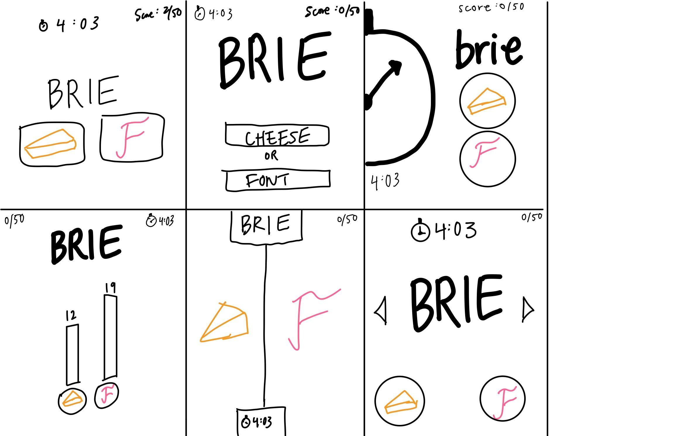
Cheese or Font
Core elements:
- Cheese/font words
- Guess options
- Timer
Supportive elements:
- Score keeper
- Descriptions
Extraneous elements:
- Response feedback
- Hints
Redesigns
Exercises
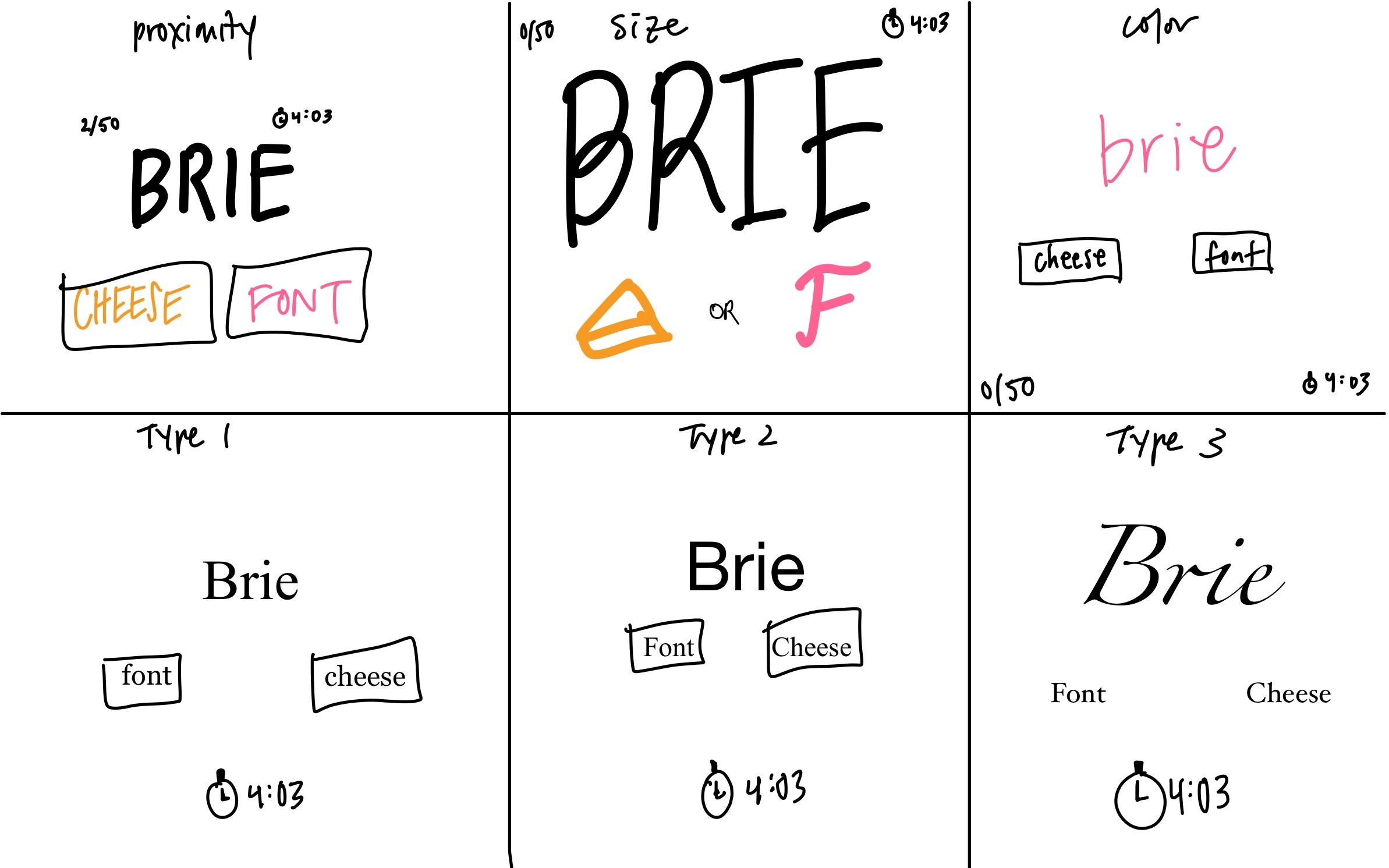
Proximity
The guess options (cheese vs. font) should be close to each other since they perform the same function and it makes sense that the two options are next to each other. The word to guess should be close to the guess options and it should come before the options in some way. For instance, naturally reading top to bottom, you should read the word first, then the guess options. I would put the timer and score board separate from the main section of word + options, so I mostly put them in corners of the screen. They are important enough that they should have their own space, and a corner provides that. Since the timer and scoreboard are quite different, so you could keep them separate because you don’t need one to use the other. However, I could see them being grouped together as a game state section for users to easily check how they are doing.
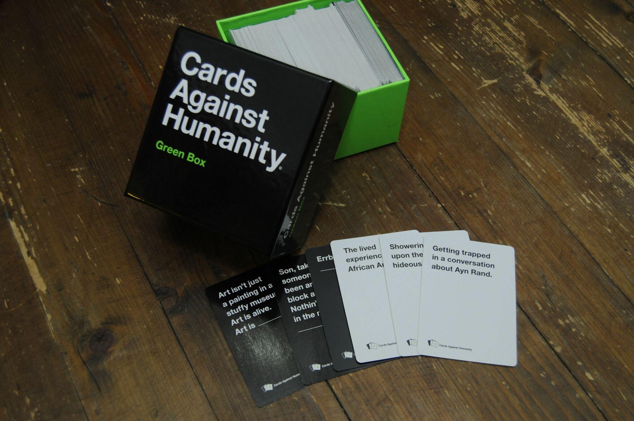
Visual Design of Cards Against Humanity
I think Cards Against Humanity does really well with its simple and minimalistic design. There is a lot of white space on the cards, but not in a way that makes it feel empty. I think the lack of extraneous elements adds to the edginess and maturity of the game. They stick with the same aesthetically pleasing sans-serif font which makes it cohesive. The cards stick to two colors – black and white. These colors are important for determining the two types of cards you can have, prompt and response cards. Since the content of the cards is usually several lines of text, they position it at the top of the card so it is easy to read, as opposed to have the sentences in the middle. At the bottom of each card is the logo and name of the game, in a small font. The placement and font size shows us this is an extraneous element. I like that there is nothing else on the card, they pretty much only stick to the core element (the prompt/response sentence). The box itself is also very minimal, with a lot of open space. I think this, combined with the black and white palette, adds to the mystery and intrigue of the game. It looks pretty unassuming to a random person, hiding how vulgar the game actually is.