

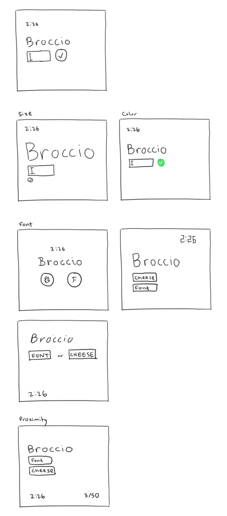
Core:
- Cheese/font name
- Way to receive input from player
- Feedback (right or wrong)
- Timer
Supportive
- Score
- Table of all cheese/font names and results
- Next/Prev buttons
- Bolding and colors
- Feedback messaging
- Hints
- ‘Give up’ option
Extraneous
- Ads
- Quiz stats
- Challenge Friends option
- Average scores
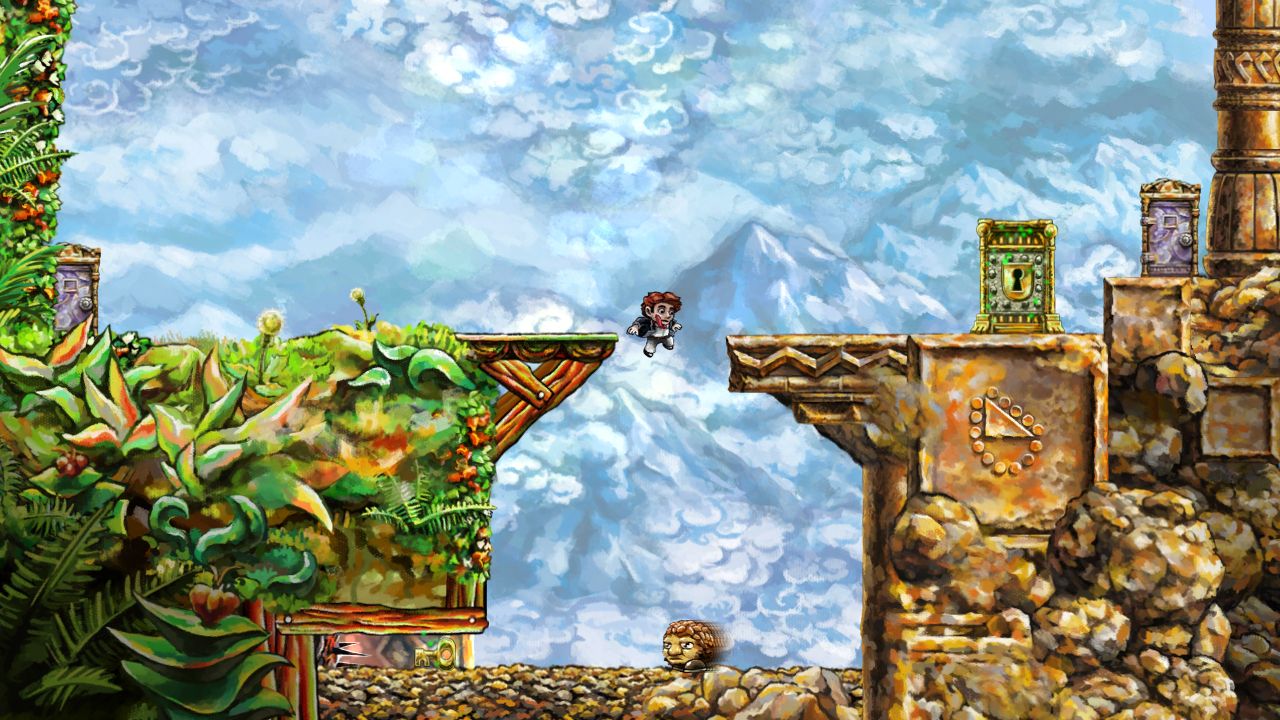
I find the indie game Braid beautiful.
- To distinguish objects that can only move forward intime, never backwards, the game puts a shimmery green aura around it (see the door and key in screenshot). This made it clear to me which items act differently from the rest of the world.
- Areas that aren’t interactable, such as the bottom left and right corners in the screenshot, are shaded darker so they don’t distract the player’s eye.
- The backgrounds are beautifully painted, but they have much more subdued colors and less contrast than the foreground where the game takes place. This makes it clear the plane the player plays in and what they can interact with.
- Objects that the player can interact with have thin black outlines, while non-interactable ones (like the flower on the left platform) don’t.
- The player is not told what keys to press to create certain actions (there’s no overlay or instruction manual), nor what the actions mean. You have to experiment in order to discover the secret powers of the game, making the accomplishments feel more earned.
- The Tim that moves backwards in time is translucent and has less color, showing that you can’t affect him.
