

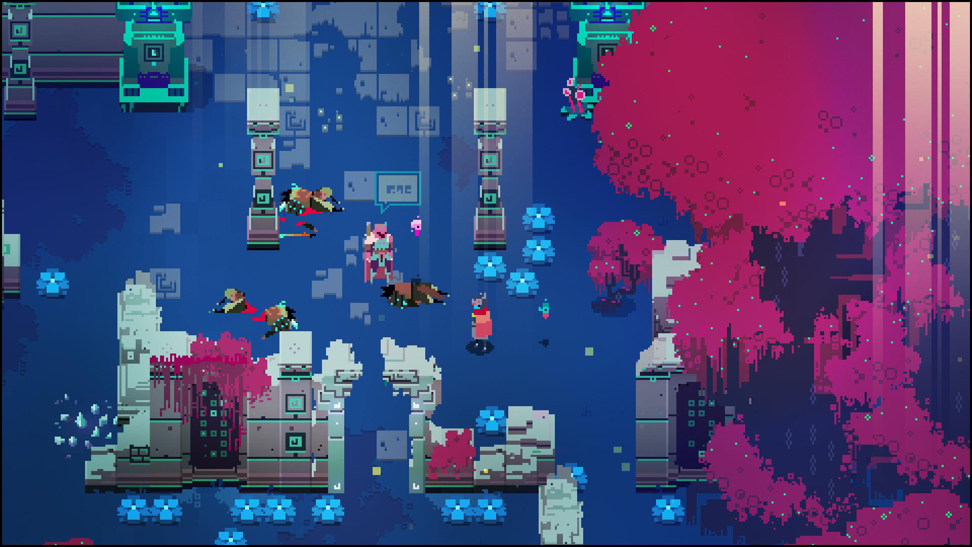
This is a screenshot from Hyper Light Drifter, the flagship action-adventure RPG of the indie game company Heart Machine.
Color
- Good contrast between warm colors (the player) and cool colors (the ground, flowers, and walls) helps players quickly block out their player and which areas of the level are navigable.
- “Good guys” (the player and the NPC with the speech bubble) share a reddish color palette, while enemies are a consistent green-brown color, which helps differentiate the two.
- I think the bright magenta tree leaves make this scene look a little busy, perhaps because they break the convention of reserving warm colors for “good guys.” However, the sacrifice in visual clarity is made up for by the visual interest that the leaves give the scene. Maybe this is a good example of when visual design principles can be broken, if you know what you’re doing.
Size:
- It isn’t demonstrated in this screenshot, but HLD uses size to roughly approximate the difficulty of enemies. Tankier, more difficult enemies are physically larger than your character. In this image, the corpses are approximately the same size as the character, indicating that they’re just goons.
- The large mass of magenta leaves give a sense that the world is large relative to the player, which is appropriate for creating an adventure game (type of fun: discovery)
Proximity:
- The blue flowers are grouped in chunks, which works to make them less distracting (in accordance to Gestalt principles, we see a few masses of flowers rather than lots of disparate flowers, which would be noisier)
