

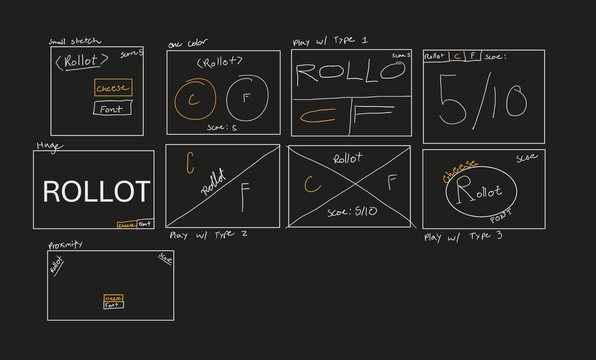
- Identify elements of cheese or font
- Core Elements:
- Words that could be names of cheeses or fonts
- Player input
- Score
- Supportive
- Telling you when you are wrong
- Timer
- Extraneous
- “Jokes” that show when you are wrong
- Enter C or F
- Give up button
- Core Elements:
- Sketch out the core elements, Make one element in a NEW thumbnail sketch HUGE, Try taking ONE color and using it in your thumbnail sketch along with black, Make 3–4 thumbnail drawings that use type in different ways
-
Explore proximity in your design (short descriptions answering the questions is ok):
- Cheese and Font Buttons should be grouped.
- Score and timer should be grouped.
- Name of font/cheese should be seperate.
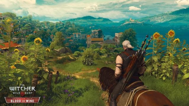
- The Witcher 3 is a beautiful game which takes realistic nature and lighting and plays with vibrance and saturation. For much of the game, saturation is low with very dull tones making colors like blood red stand out. The Blood and Wine expansion, however, runs in the opposite direction and increases saturation to make everything feel like a fairy tale painting. This creates a strong contrast. In the image above, Geralt takes up much of the frame. This plays into the design principle of sizing. Geralt is large compared to the city in the mid-ground. The image is mostly uniform blues and greens, which makes the sunflower colors and the color of Geralt’s horse stand out. The image uses proximity as well. Geralt is within close proximity to the town, which is also in close proximity to the building off in the distance. This causes one’s eye to wander along a path, which is the same path the player may choose to take.
