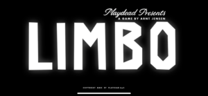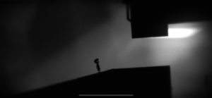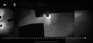
Not to beat a dead horse, but I think that Limbo is a very beautiful game, largely because of its visual simplicity. Although Limbo is entirely in grey-scale, it utilizes color and contrast beautifully, as the foreground is shown in ink black and the background in shades of white and grey. This simplicity pays off the most when the occasional extra item pops up, which is shown in an eerie, glowing white, made all the more ethereal by the contrast from the otherwise gloomy palette. Limbo also uses proximity very well, easily distinguishing each task from the previous (given that Limbo is a side-scroller, there could potentially be the risk of the different stages bleeding into each other). As most of the challenges within Limbo are spatial awareness-related, the levels themselves create an element of spatial beauty. Additionally, the avatar himself is so small compared to his surroundings that the player immediately feels a sense of both awe and fear about their surroundings. Finally, Limbo’s loading screen uses very dramatic typography to introduce the visual themes of scale as already mentioned, and creates a very separate aesthetic for the loading screen as compared to the rest of the game. The font used is reminiscent of the shape of the world within the game, which uses large straight lines and slightly imperfect angles.