Core Elements:
- Names of Cheese or Fonts
- Entry Box for Answer
- Current Score
- 5-min timer
Supportive Elements:
- Previous and Next Buttons
- Pause Button
- Number of plays
- Game Rating
- Average Score
Extraneous Elements:
- Grid layout
- Percent vs. Fraction Score
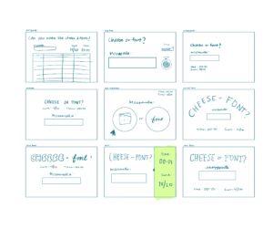
Promixity:
I tried to maintain three main parts in all of the designs: the title, the score and time, and the question. Having these three parts separated, I tried to make sure that there was a considerable space between the components. This would make it more obvious as to what parts you should interact with, what parts are there for viewing, etc.
Beautiful Game:
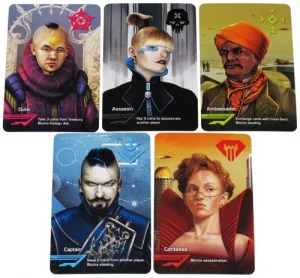
One game that I think has beautiful graphic design is Coup. In Coup, there are 5 different types of cards, each of which represent a person with a specific ability. The first thing that stands out is the contrast in colors. For each card, there is a color scheme (ex. Duke is pink and purple). This makes the cards easily identifiable right at first glance. Even when holding the cards in your hand, the background color of each card differs, so it is fairly easily to tell which is which by only looking at the corner of the cards. If you happen to hold the cards fanning out to the left, there are symbols (again, with their distinctive color) that help identify the card. On the bottom of each card, the main role of the character is underlined with a cool design, and their actual power is written in a smaller font next to it. There is also an illustration of each character that takes up the majority of the card, providing aesthetic appeal and a very easy way to quickly identify cards.