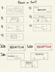
Core
- Names of the fonts and cheese
- A place to put your answer
- Timer
- Score
Supportive
- Instructions saying to put f or c
- Text saying if you got it right or wrong
- Score percentage
- Average score
- “Cheese or font?” label
- Replay button
Extraneous
- Color
- Custom answers to wrong answers
Portal 2 Analysis:
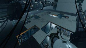
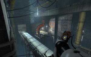
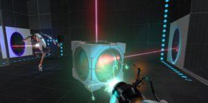
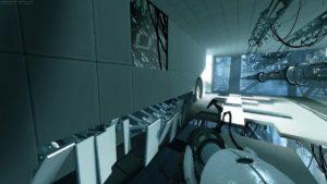
This isn’t the most “beautiful” game in the conventional sense of the word, but one game that I think has an extremely well-defined aesthetic is Portal 2. It has a cold color palette with dull grays, sterile-whites, and blue-ish tints that feels industrial, dystopian, and sci-fi. Of course, the game has those characteristic blue and orange portals that leave a visceral mark on the players (and overall helps visualize the overall gameplay mechanics of the portals). The gun cursor is similarly elegant, and simplistic with a nice symmetry that is pleasing to look at. Light in general is used effectively in the game either as a gameplay mechanism (lasers to kill turrets) or as a way to create atmosphere such as the bright sterile lighting of the rooms or the industrial lighting of the facility.