Cheese or Font: Game Elements
Core elements of the game include:
- name of the cheese/font
- score tracker of how many have been answered correctly out of the 50
- a countdown timer for 5 minutes
- player input/answer
Supportive elements of the game include:
- previous and next buttons (As long as the player types in ‘C’ or ‘F’, the game automatically moves onto the next cheese/font. Additionally, players can manually click on the table to go back and forth or out of order.)
- table labels: “Cheese or font” and “Enter C or F”
- table with all 50 cheese/font for record tracking
- error messages
- pause timer button
- give up button
- replay button
Extraneous elements of the game include:
- color coding schema
- quiz statistics, challenge friends, random quiz, next quiz, average score
- the length of error messages
Cheese or Font: Graphic Design Thumbnails

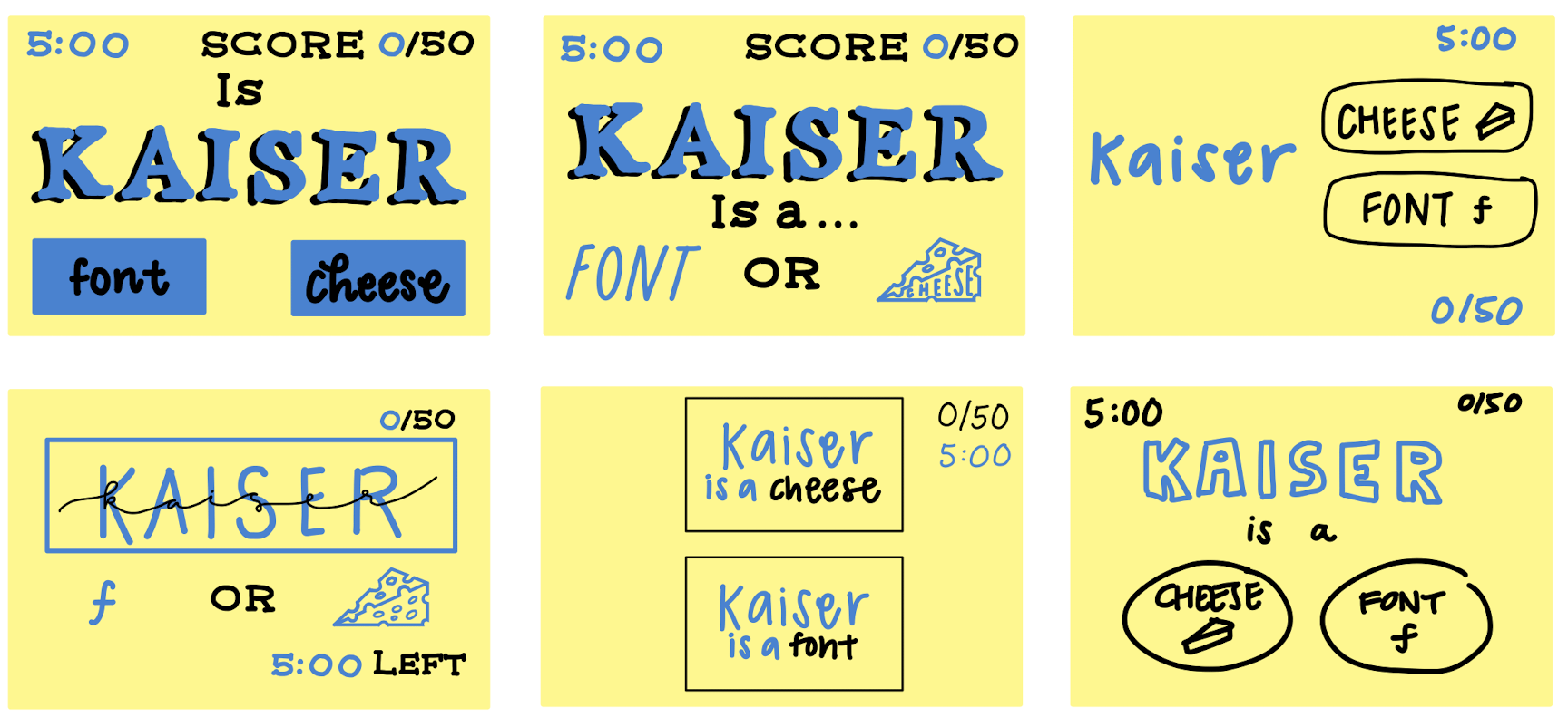
For the first design, I sketched the core elements: name, score, timer, and player answer.
For the second design, I worked with size. I made the name of the cheese/font huge and worked with typography and visual aesthetics.
For the third design, I used color to differentiate the name of the cheese/font and other supporting elements from the player choice buttons. I wanted all player clickable elements to be in one color, to reduce confusion.
For the remaining designs, I worked on typography, visual alignment (top down with adequate whitespace in between), color contrast for text, rather than imagery, and how to apply color accordingly. I used different fonts for my designs overall and experimented on the size of the name of the cheese/font vs. the player choices. In some designs, I chose to highlight the player options only and in other designs, I chose to give equal attention to core and supporting elements.
I explored element proximity and grouping in my design. In one design I grouped both the name and the player options into one clickable button, repeating the name of the cheese/font in both options. In another design, I used boxes and highlighting lines to distinguish the name from other options, bringing immediate bringing immediate attention to the name first, then the options. I took care to not give too much attention to supporting and extraneous elements of the game so I could best test out the core elements.
A Beautiful Game: Sable
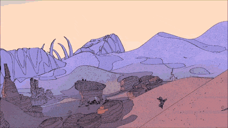
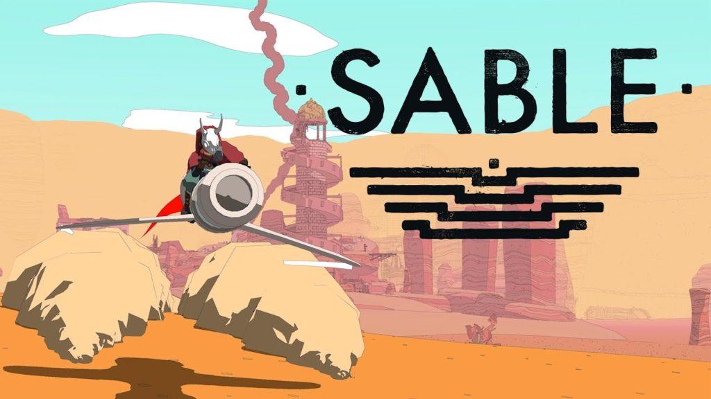 Sable, an open-world exploration indie game created by Shedworks, is visually stunning. The game revolves around a girl named Sable who voyages to different worlds and explores. It is a minimalistic style game with NPC dialogues and on-screen instructions inspired by The Legend of Zelda: Breath of the Wild. It merges line art with games and the on-screen text uses good color and contrast, as seen with the consistent dull shade of beige and black.
The typography and font is simple and resembles a Sans/Sans-Serif font. The NPC text and the player interaction text are different typographies to make a distinction.
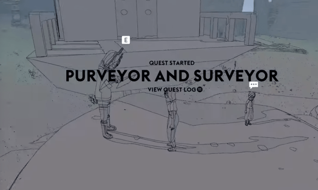
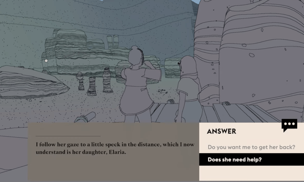
Here we see a good use of size and proximity at a quest screen. The quest name is in huge font compared to other supporting or extraneous elements on screen. Overall, I really enjoy watching gameplays of Sable and it feels like an adventure book come to life!