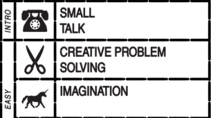
Exercises:
Game: Transmission
![]()
Why the graphic design is good:
Size: readable font and symbols without it being overwhelming.
Contrast: the white on dark (but gradient to add interest) background really stands out.
Type: sans serif makes sense for a game that is themed around technology
Proximity: grouping of the help and menu buttons in the upper left and the main game in the middle is clear.