Elements of Cheese or Font
- Core: Name of cheese or font
- Core: Player response (e.g. input field)
- Core: Navigation (e.g. previous & next buttons)
- Core: Countdown timer (5 mins)
- Core: Score (out of 50)
- Supportive: “Cheese or font?”, “Enter C or F”
- Supportive: Table showing all 50 cheeses & fonts at once
- Extraneous: Color coding of correct (green) & incorrect (red) responses
- Extraneous: Feedback messages
Design Screenshot
Design Explanation
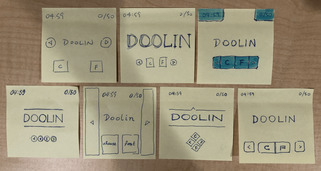
For the 1st design, I sketched out the core elements: prompt, navigation arrows, user input (C or F), timer, and score.
For the 2nd design, I made one element (the prompt) huge.
For the 3rd design, I highlighted the elements of interest (timer, score, navigation, and input buttons) with color.
For the 4th to 7th designs, I experimented with different fonts, sizes, arrangements, and proximities. For the 4th and 6th designs, I used the enclosing lines and minimalistic font to emphasize the prompt. On the other hand, I made the font size for the timer and score very small compared to the prompt, so they would not distract the user during gameplay. For the 5th iteration, I tried a form-fitting design to maximize the use of space, but I didn’t like how the buttons and prompt were squished and dwarfed by the navigation arrows. The 4th and 6th designs have the buttons grouped (proximity) in a linear design and a cross-shaped design, respectively. I improved upon this in the 7th design, where I intentionally grouped the C and F buttons by joining their inner borders into one rounded rectangle, while leaving the unassociated navigation buttons separate. I felt this made the most sense.
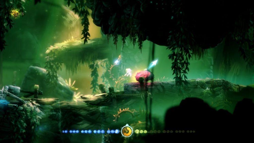
A Beautiful Game
“Ori and the Blind Forest” is, to me, an indisputably beautiful game. Officially classified as a Metroidvania 2D platformer, it presents a very emotional narrative complimented by an immersive soundtrack, well-designed levels, and incredible visual design. The colors inform the player of the level or area he is currently in and, perhaps more importantly, help set the mood of the scene. Happy scenes are often displayed in florid and lush greens, for example, mysterious scenes in purplish hues, and scary scenes in black and blue. The design principles of color / contrast and proximity can be seen in the gauge on the bottom. Both energy (blue) and health (green) orbs are grouped in threes so the user can count them more easily.