


Goutham & David
PLAY THE GAME HERE:
https://goatgo.itch.io/factions
ORIGINAL VERSION
UPDATED VERSION
For Project 4, we wanted to take Goutham’s digital version of Factions and polish it even more. We liked the initial design, with it’s striking colors and clear UI, but wanted to up the readability and really finalize the UI. In order to do this, we made three major changes:
- Changed the tiles
- Added sounds
- Changed the selection UI
We also did some bug-fixing under the hood, which certainly made it feel more polished as well!
TILES
One of our goals was to clearly distinguish between the two sets of tiles for each player. We liked the basic aesthetic from the original version, but wanted to make sure that they would read clearly at a glance, even if people were colorblind. The colors for the initial version were differentiable even with colorblindness, but both teams had the same icon – a circle – as well as the neutral tiles.
Version 1: The original pieces.
So, to differentiate them further we made one team squares, one triangles, and the neutral tiles circles. We also initially tried changing the colors to more saturated colors, but on the black UI they ended up being too dark, and didn’t pop out of the background as well.
Version 2: Different colors, different shapes.
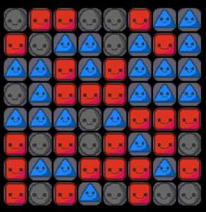
Ultimately, we settled on the original colors, which were clearly readable and distinguished from the background, with the updated shapes:
Final version: Original colors, different shapes.
The only changes we made to the colors were the outlines: rather than having a default dark red, they matched the colors of the associated tile. All told, this struck a good balance between being able to clearly tell the tiles apart, and making sure that the board clearly contrasted with the background UI.
SOUNDS
To make the experience of playing more engaging, and give the player more feedback on their actions, we added sounds. Some of these primarily served to add to the tactile sensation of moving your pieces around on the board. Now, when you slid and rotated your tetris piece, you would get audio feedback as well. Other sound effects also helped to reinforce the rules of the game, and give the player feedback when they couldn’t do something. For example, when a would-be placement was invalid, or when the player had scrolled all the way to the end of the available pieces, we added an error sound.
All told, this helped liven up the experience of play, and added another channel for us to guide the players through the game. To get a sense of the sounds, please watch the How To Play video at the end of the post!
UI
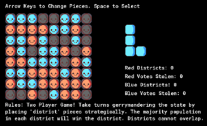
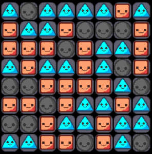
We wanted to keep the UI simple, and liked that it was clearly readable on a single screen. However, we had some issues with the piece selection UI in particular. In Factions, the player has a set number of pieces to choose from, and can scroll left and right to select them. In the original version, that UI looked like this:
Original version.
The piece being selected would change as you pressed left and right, and there was a prompt at the top of the screen telling the player how to select a piece:
The prompt.
![]()
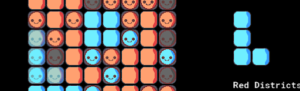
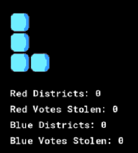
However, it wasn’t immediately clear from the UI itself how to interact with the pieces, and there wasn’t quite enough space to display all of the pieces:
The long tile would leave the piece selection portion of the UI,
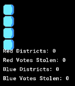
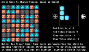
We made two main changes to the UI to correct these issues. First, we created a larger, clearly delineated square with the pieces inside of it. This version was centered and generally looked better, and prevented pieces from overlapping with the rest of the UI. Second, we added left and right arrows. These arrows served multiple functions. They added an additional cue to the player, on top of the prompt at the top of the screen, to move left and right to select. However, they also grayed out when the player got to the end of the list of pieces, to show that there were no more to select. In the previous version when this happened the pieces simply stopped changing, but there wasn’t any explicit feedback that the player was out of options.
Final piece selection UI. Note that the arrow on the left is grayed out, to indicate that there are no more pieces to select in that direction.
How to Play: https://youtu.be/kto69QuDn80
FUTURE IMPROVEMENTS:
We’re pretty happy with how this project turned out! We have a pretty satisfying gameplay loop and clear learning objectives. However, in terms of making this a complete game, we’d need to implement a clear win condition. At the moment, the game ends when the players determine an ending but in the future we hope to implement this!
https://mechanicsofmagic.com/2022/03/15/p4-tragedy-of-the-commons/
Sorry I commented on the wrong post………… ignore that…