

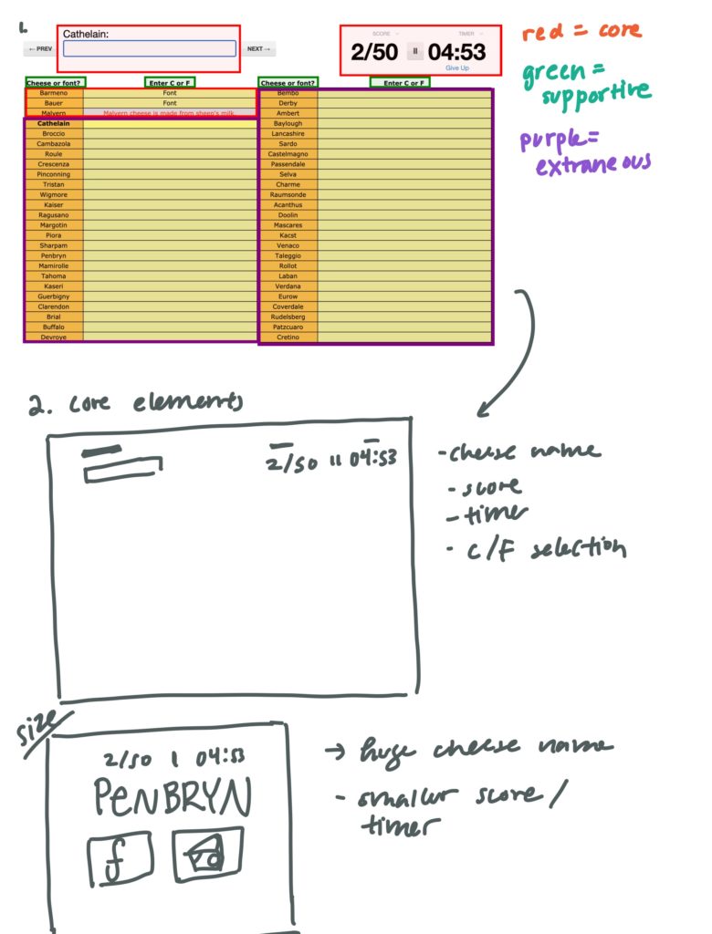
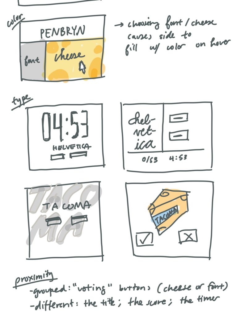
Proximity exploration:
For cheese or font, the main elements that seem the most similar are the “cheese” and “font” buttons that essentially mark a given name as a cheese or font. If I were to include some kind of list of previously voted names as well, they could be used as another group (having all been “previously voted on” as their common factor). From my mocks, the name of the cheese/font itself, the score, and the timer seem to be more different from the rest (although the score and the timer could be grouped together as a form of game “metadata”).
A game that I think is quite beautiful is Pikuniku! The game does a really good job of using graphic design principles to evoke playful and cute vibes, while leaving some parts a little off / strangely unexplained to bring in some of the vague ~ dystopian ~ themes that the game altogether explores in the game.
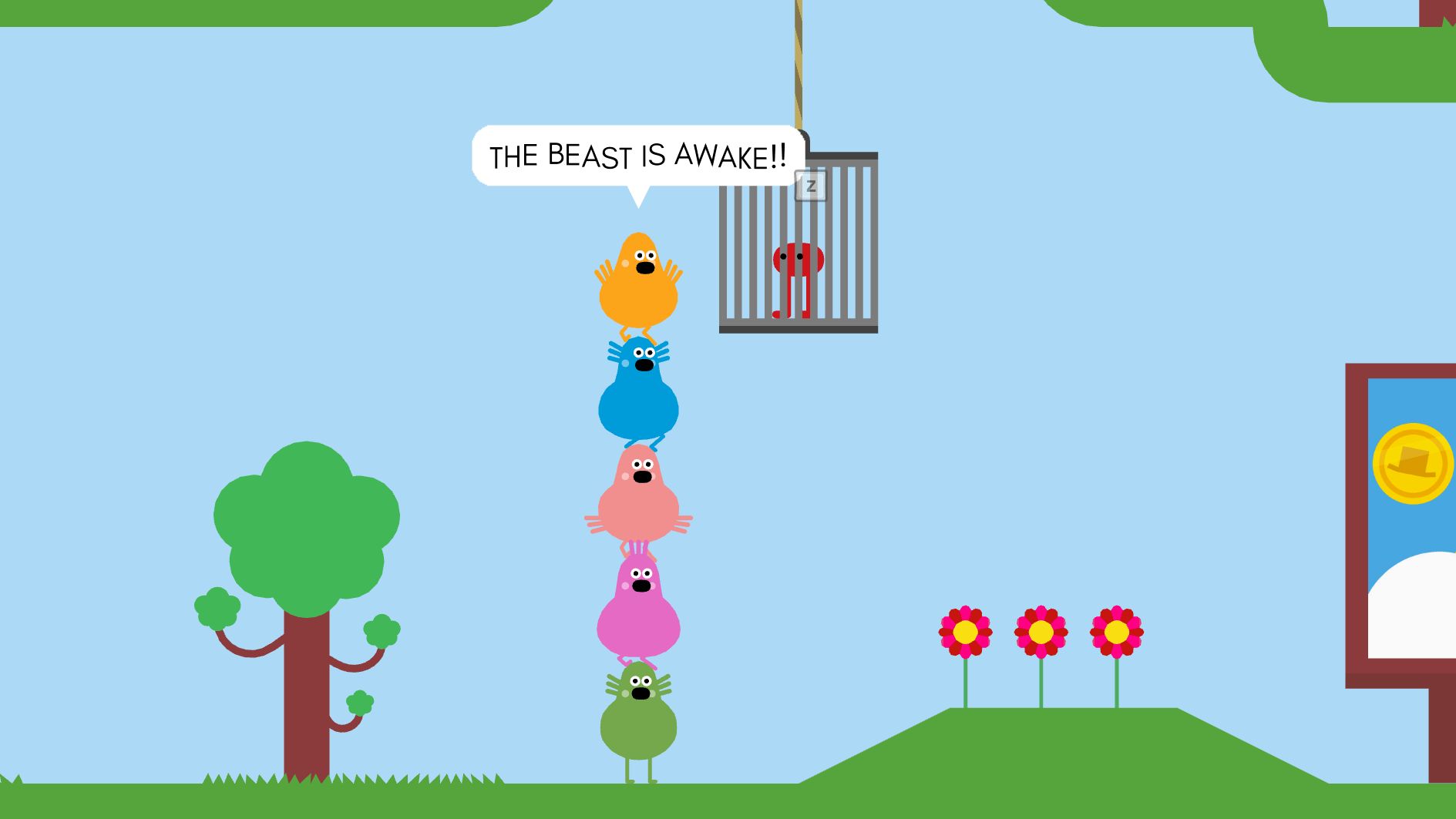
Some of the specific visual elements that help with the “fun” narrative include: the simple shapes used to build much of the scenery (the tree, flowers, billboard, and ground are all built pretty much using circles, rectangles, and triangles); the slightly unaligned sans serif with rounded end caps in the speech bubble; the bright colors of the characters (yet still maintaining a set color palette — nothing looks garish here). In this specific screenshot, the stack of villagers leading up to the cage of the beast helps draw the player’s eyes to their own character; it also makes you question what kind of world the game is set in (Why are there stacked villagers??? Why is there a “beast” in this otherwise seemingly innocent universe)
