

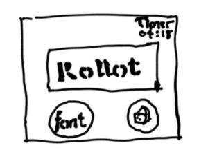
Identify all the elements of Cheese or Font. Label them as core, supportive or extraneous. Core is the parts you need for gameplay, supportive is things like hints and instructions, and extraneous are things you could remove
Core
- The various cheese or font entries
- The textbox to enter the players choice
- Timer that’s critical to the nature of the game
Supportive
- Score which shows you what you have so far
- Feedback whether you got the answer right or wrong
- Next and previous buttons
Extraneous
- Display of all the entries of cheese and fonts
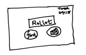
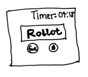
Do a quick, small sketch of the game on a small piece of paper. Only use core elements. Small matters, because it constrains your ability to get fiddly. Standard 3×3 or 3×4 is good. If you must draw on an ipad, don’t zoom. Suck it up and stay small.
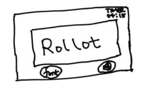
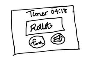
Make one element in a NEW thumbnail sketch HUGE. What else do you want to change? What can get smaller?
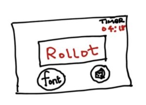
Try taking ONE color and using it in your thumbnail sketch along with black. You can also use gray and white, if you have the tools.
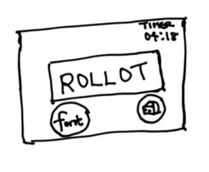
Make 3–4 thumbnail drawings that use type in different ways.
Explore proximity in your design. What should be grouped? What is different, and thus should be separated from gameplay?
The two buttons for choosing font and cheese should be grouped. The display for the entry should be separated from the buttons and from the timer
A game I think is beautiful
QWOP is a simple game with a simple goal: successfully run 100 meters. You have to manually control the thighs and calves of the runner
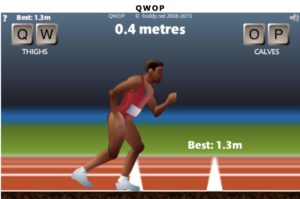
The game has a nice use of colors to create the scene of a track field. It uses different colors to highlight the track, the runner, the background, and the stand.
It uses proximity by grouping the buttons for controlling the thighs, the calves, and separating them from the athlete and from the track.
The game also makes the runner huge thus being the central figure of the game.
It uses a smaller font size to highlight the record distance so far, and different font sizes for the distance run, the thighs, and calves button.
