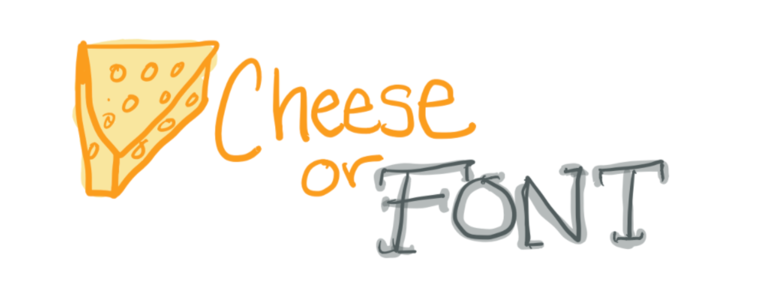
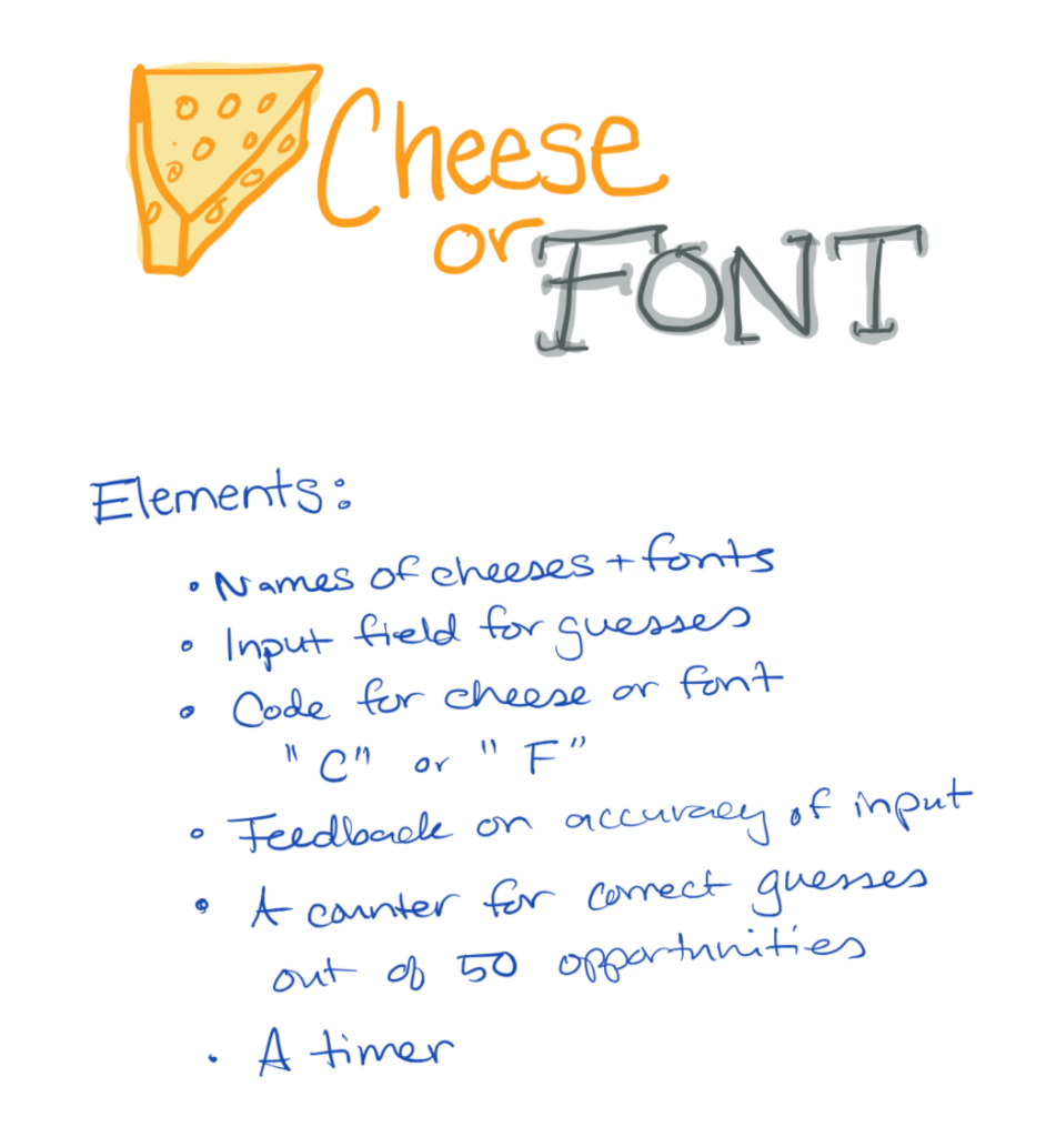
This week, I read and completed the exercises in Christina’s Medium article on Graphic Design for Game Designers. We worked with the hilarious and surprisingly difficult game, Cheese or Font.
First, I identified some of the elements of the game. The names and input fields for guesses are core elements, while other elements are supportive: the timer, counter, feedback on accuracy of guesses.
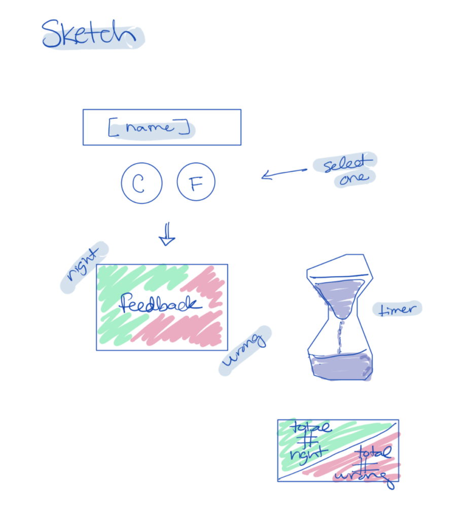
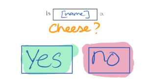
Then, I briefly sketched out the elements:
And continued to sketch using smaller surface areas (about the size of a post-it).
I explored making one element of a sketch HUGE:
I also explored taking only one color to sketch along with black:
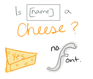
I played around with using type (as well as size) in different ways:
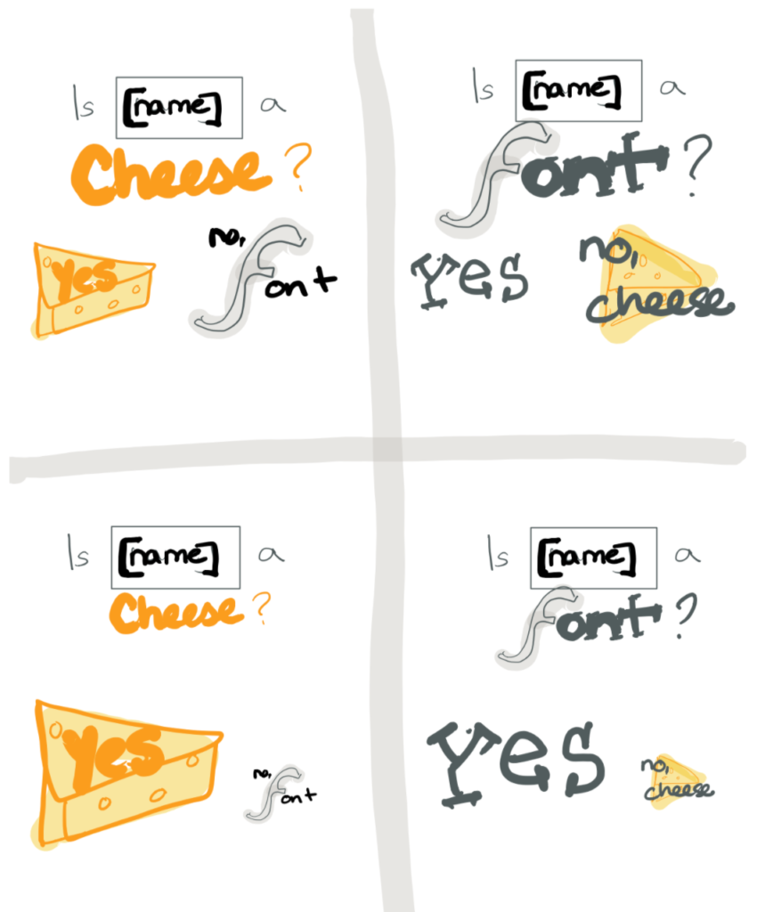
Lastly, I explored proximity of elements:
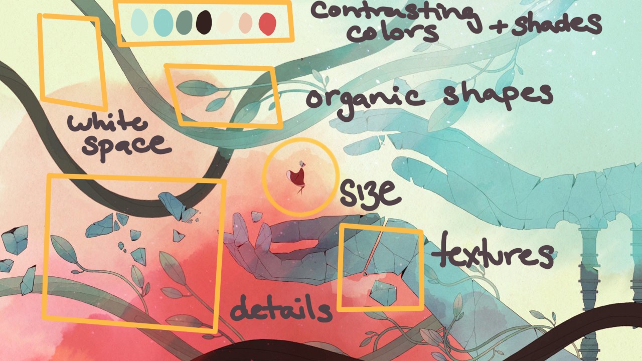
I was able to identify many of these principles in one of my favorite looking games: Gris. For example, I love the choice and application of color. They use lots of complementary shades, hues, and values to create a sense of coherence through their color palette. They add texture with watercolor and thin lines to outline detail. They also do a great job leveraging white space and using size and proximity to contrast different elements on the screen. For example, the protagonist is often displayed as small as possible to create a sense of vastness in her environment. They also use organic and familiar shapes such as leaves which alongside their use of texture and color, makes the game feel both fantastical and natural.