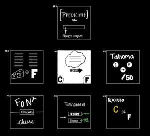
1 Identify all the elements of Cheese or Font
- Core
- Predicates (words to be judged)
- player input
- skip button
- Supportive
- two/separate columns
- Score
- “Enter ‘C’ for ‘Cheese’ and ‘F’ for ‘Font'”
- Timer
- Incorrect answer alert
- Extraneous — things that could be removed
- The comments for incorrect answers
- button saying the game is in forced order
- give up button
2 Sketch out the core elements
3 Make one element in a NEW thumbnail sketch HUGE
4 Try taking ONE color and using it in your thumbnail sketch along with black
5 Make 3-4 thumbnail drawings that use type in different ways

6 Explore proximity in your design (short descriptions answering the questions is ok)
- It is evident that the font and cheese buttons should be close in proximity
- The word to categorize should be of a reasonably large size
- The score needs to be small in relation to the cheese/font buttons and the actual word to be guessed

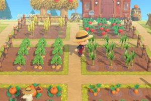
The game that I chose that I think is beautiful is Animal Crossing. This a life-simulation game known for its calming principles, lullaby-like soundtrack, and its unique art style. It is beautiful for many reasons, but in terms of graphic design and its design patters, I think this game is beautiful because of the use of the soft color palette. In order to further enhance the calming qualities of the game, designers chose a more muted color scheme to work with. For most of the game, the colors remain in this muted scheme but on events like a freshly caught fish, new insect or a uncovered fossil, vibrant colors are brought to the screen in the form of animations like flashing exclamation points above your avatar’s head. Additionally, in regard to the design principle of positioning, when you are waltzing around the island, the camera angle continuously shifts to give you the best perspective of your avatar and when you manipulate something on your person, the angle changes to imitate having the actual POV of your character.


