

Exercises:
Tiny Wings’ Visual Design
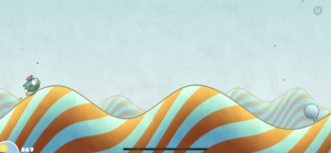
Tiny Wings’ design is super simple, but works really well. They have a great use of color, size, alignment, and proximity.
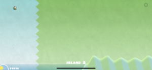
The visual design communicates a strong emphasis on the game itself. The game’s progress (how much sun is left) is small and on the bottom right — out of the way, but glanceable during the game. The pause button is also very small at the top right of the screen, and after the player hits pause, then more options and game information appears on the screen.
Each level looks a little different, with a beautiful color pairings for each level (so, it doesn’t use too many colors, but looks really lively). The little bird’s color doesn’t pop that much, but the movement of the bird is enough to make it the center of attention.
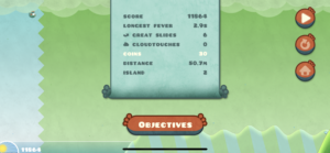
The paused view also has a good use of colors: orange (accents) for buttons, and blue (which blends more into the rest of the screen) for game stats. It also aligns the “Objectives”/”Stats” button with the info page, which indicates that they are grouped together, while the three buttons on the right are also aligned and group, indicating that they are related actions.
While the design only uses one bubbly font, they play around with size and color to emphasize certain text as headers etc.
