Cheese or Font:
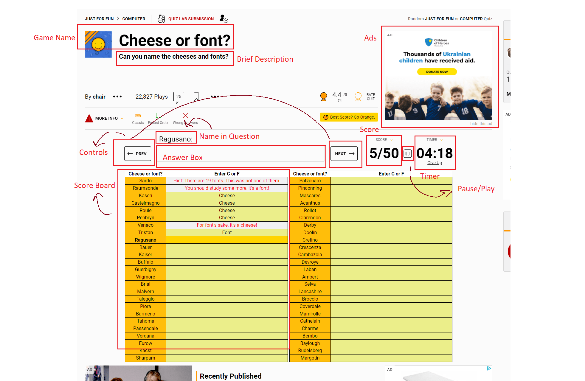
- core elements
-
- Name in Question
- Answer Box
-
- supporting elements
-
- Score Board
- Timer
- Score
- Previous/next controls
- Pause/play
-
- extraneous elements
-
-
- Comments in the Score Board
- Game Name
- Brief Description
- Ads
-
Here are the exercises from the blog post!
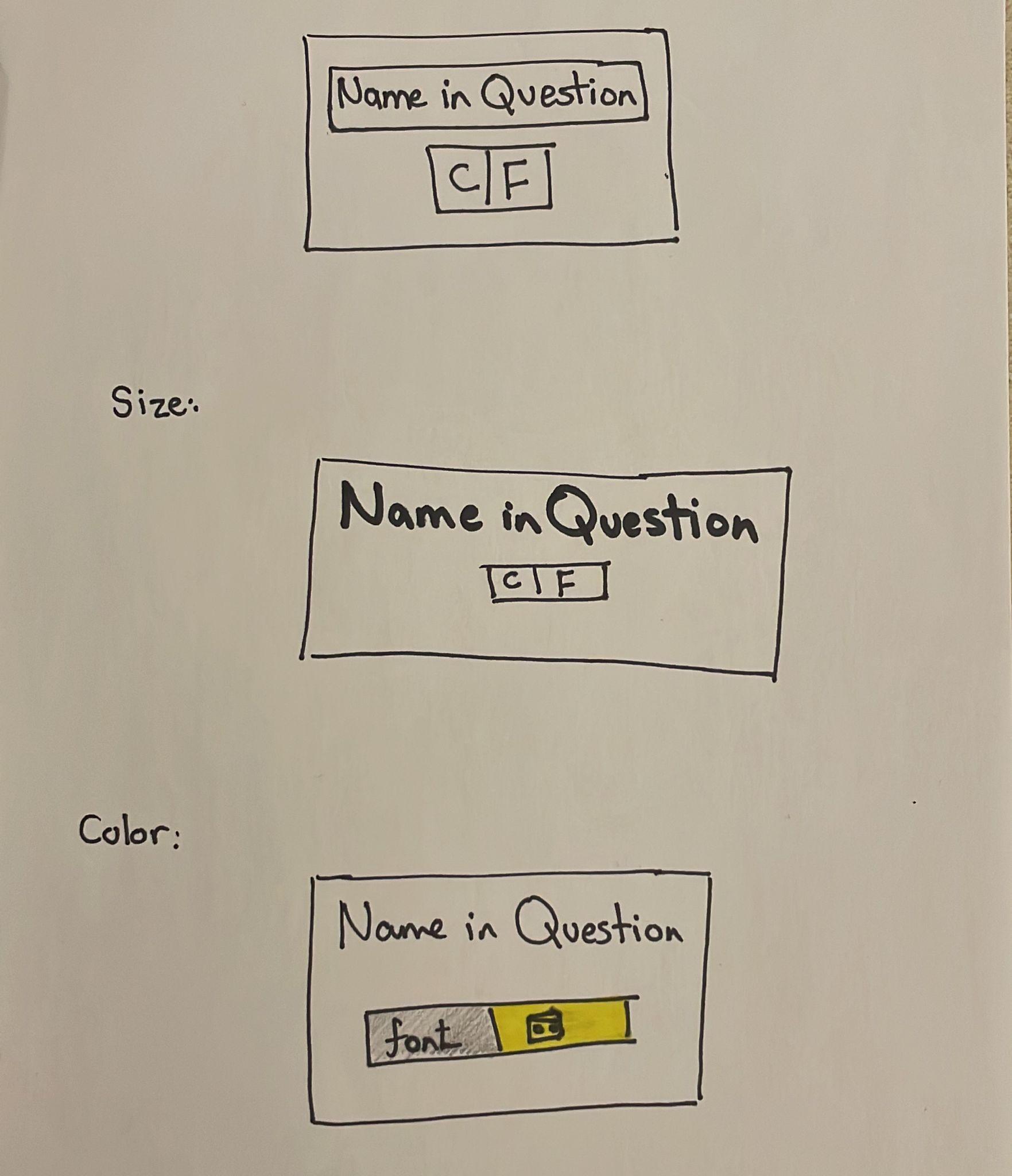
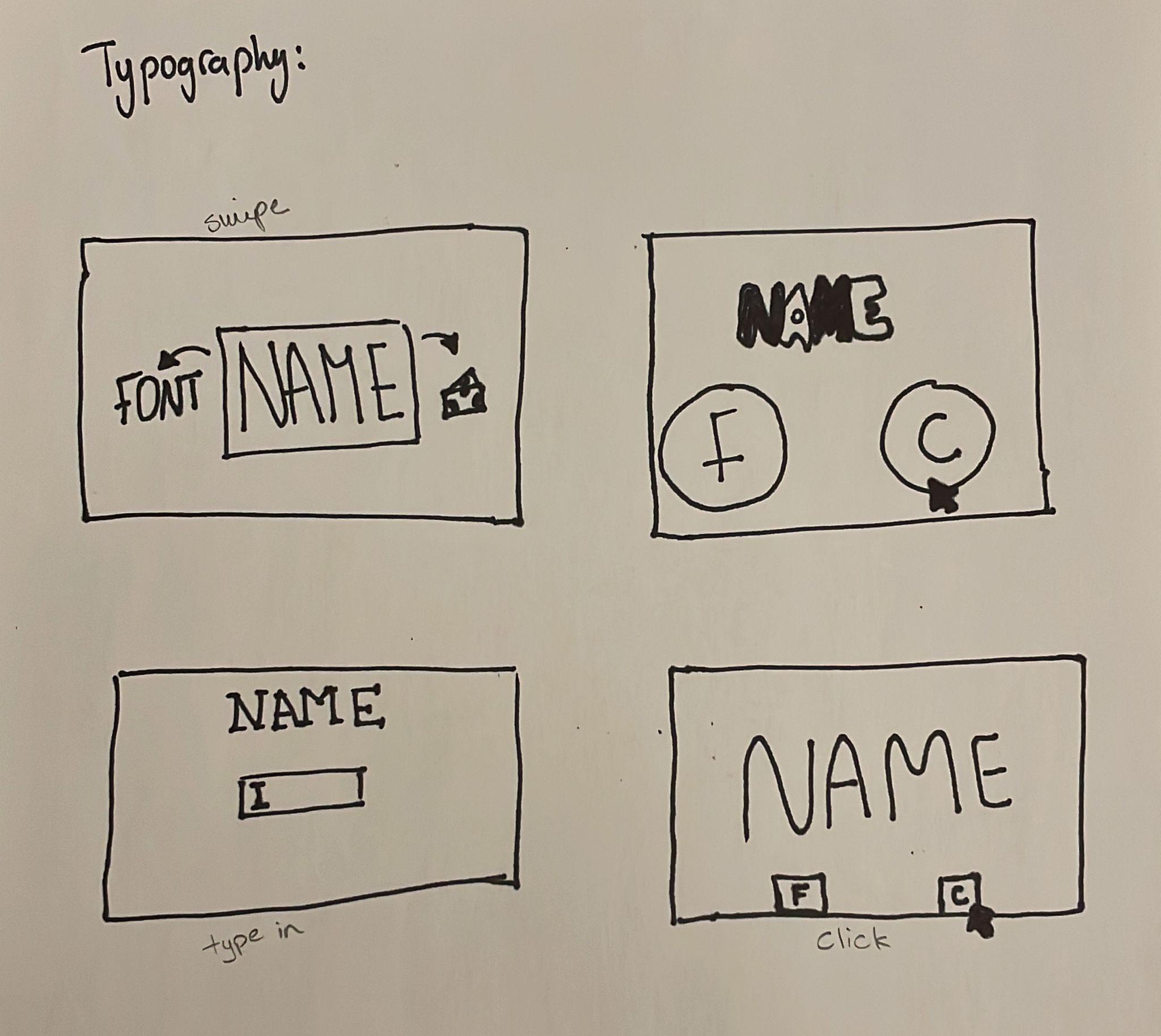
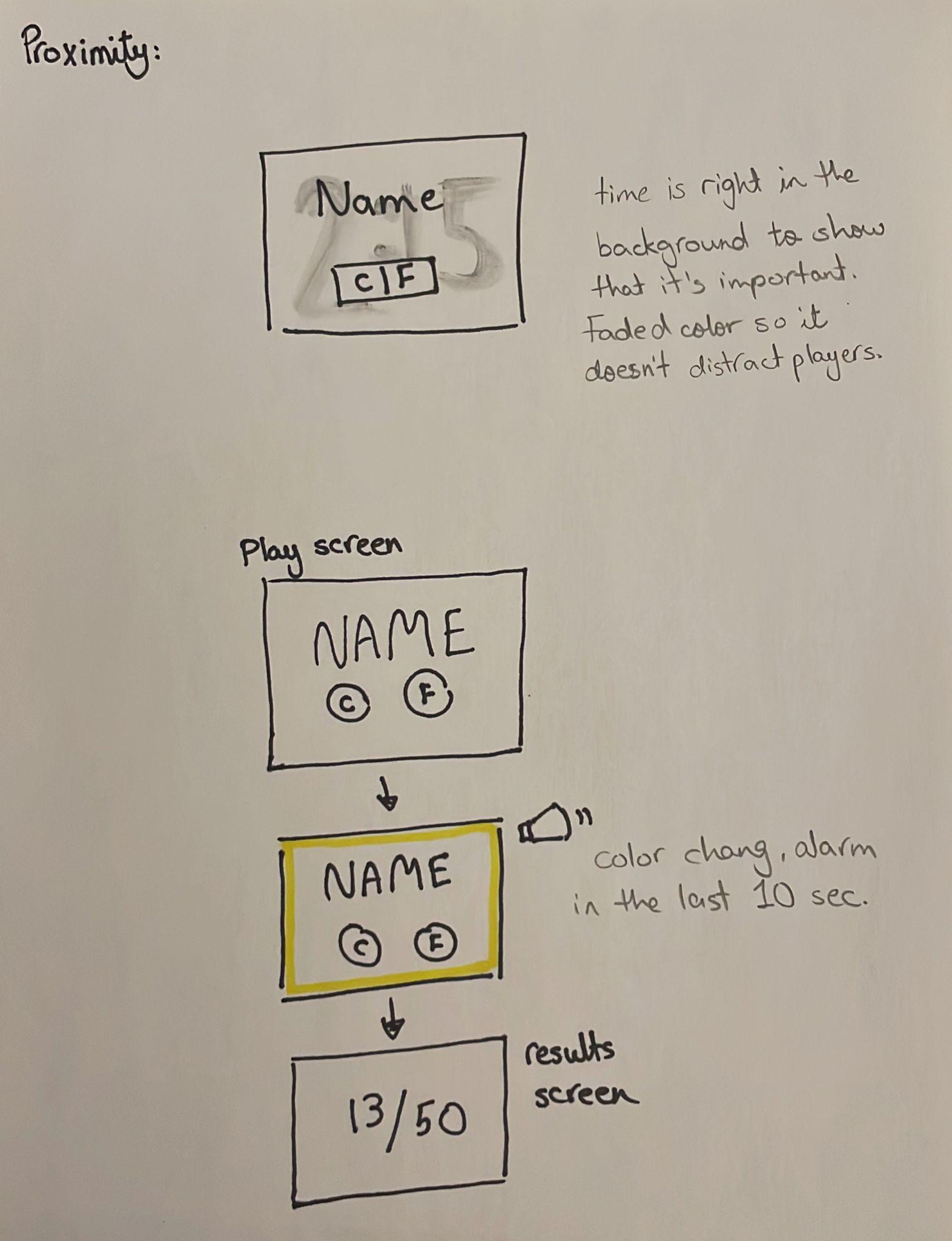
With proximity, I decided to add the timer, and see how can I emphasize its importance. It seemed interesting to have it in a fade color in the background behind everything going on with the core elements. Another design would not have a timer, and would flash lights and beep when there is only 10 seconds left, after which the game stops and players get to see their results at once.
Two Dots:
For the analysis, I decided to go with Two Dots, especially since the game’s graphics were the reason I started playing it. In this game, players have to connect dots of the similar color together, and have to obtain certain number of dots in certain colors in a certain number of moves. This is how the game’s interface looks like:
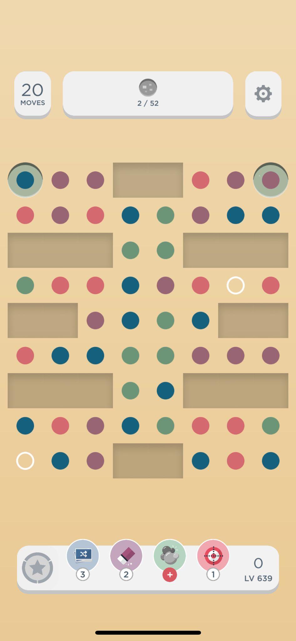
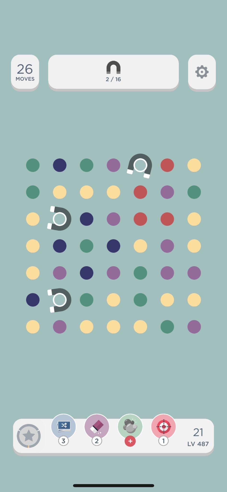
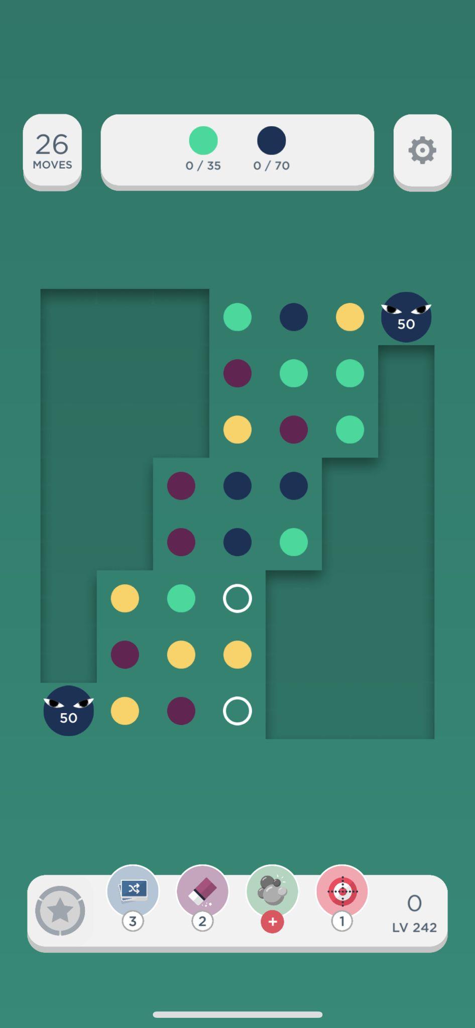
The core elements in this game would be the dots, the goal at the top, and the number of moves. It can be noted that in different stages, color palettes change depending on the theme, yet it maintains a certain level of consistency that makes it easy to identify it as Two Dots no matter what level it is.
For proximity, designers chose the top bar for the important elements: number of moves left, the goal, and setting. At the bottom, I notice that the “special moves” are grouped together. I also wonder if they were placed at the bottom where it is easier to access them so that players would want to use and purchase more special moves.
The font used in the game is most likely Gotham (based on Qoura and a quick research). The design of the game screen can be considered minimalist, especially when compared to the home screen (shown below), where one can notice much more details and drawings. I assume this was made to allow player to focus on finding the pattern they need in the game without being overwhelmed by the graphics and other elements.
