

Blek
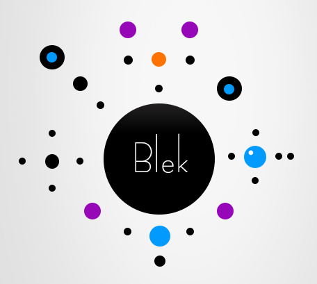
I played Blek a long time ago back when it first came out, and although I didn’t remember the name anymore, its striking visual design cemented itself in my head, and a few minutes of Googling gave its name. I think what Blek does really well (excluding the gameplay because that is not the point of this exercise) is it’s use of color and contrast. As seen in the promo photo, the entirety of Blek is black circles on a white background, but the goal/powerups/other mechanics that I don’t remember are a different color, and boldly so, so that the player’s attention is immediately drawn to it. Even the aspect that the player controls is drawn in black, which blends in with the black circles (obstacles), which continue to highlight the importance of the goal since those are the only ones with any non-grayscale colors. Furthermore, the typography accentuates the modernity and minimalism of the game. Since serifs can be considered an almost Baroque level of ornamentation, the sleek sans-serif font stresses the minimalistic and meditative quality of the game, something that is bolstered by its gameplay.
